ROUTE 3
ROUTE 2
ROUTE 1
PianPian & Max
10.03.2020, Sai Ma, Nonthaburi
Win Shanokprasith (WS) — When is a work finished?
16.03.2020, On Nut BTS, Bangkok
Pianpian He (PH) & Max Harvey (MH) — Finished as in being in a state of completeness? We think this could mean several things. For some, it could be that decisive moment when a work is strong enough to be presented to a client. For others, it could be when a project has been approved, delivered and paid for. We have heard the question being asked to artists mostly, especially painters. “When is a work finished?” For designers, the easy answer is when the deadline comes up. Tic. Toc.
We wouldn’t know how to answer this question with exactness, a part of it relates to instinct, but in a project, whether it is commissioned by someone or something you do for yourself, you try to attain certain goals you set for yourself. A lot of that has to do with control, but we have a lot of issues with that word nowadays. We have been working on a bi-annual journal with writings on Southeast Asian culture called paan. The first issue, titled Crossing Fire-line, contains four original articles commissioned by the editor Jiahui Zeng. It also features one photo essay and seven poems. All texts are presented in at least two languages: mainly Mandarin and English. The project has been ongoing for about a year and half already. It’s been lagging behind because we are under a budget that isn’t realistic for the amount of work a multilingual publication requires, but also because we’ve encountered production setbacks as well as political problems. We have previously announced the project to be out this last December, however the content of the publication ended up being alarming for the printer. The same printer already had wet proofs and a few book dummies produced for paan. Although the printing company can hardly tell what the publication is really about, it appears they deemed the content to be “too sensitive”, which is to say that at a glance, the content does not look all rosy rosy, that its visual qualities and the language used within its pages seem not to put China in its best light. Nonetheless, paan isn’t about any of China’s involvement in and with anything. The texts tell specific stories about people of politics in post-war Asia and recount critical moments in the recent history of Asian societies. Yet, while carrying such characteristics, this publication is not allowed to exist. We have a budget that is sufficient to get the production of the publication ongoing, but our contact isn’t willing to proceed out of fear for its enterprise. In the following weeks, a few other printers followed-up with the same kind of responses. We were once told, “a catalogue of works, of paintings, would have been fine to produce, yours has way too much text”.
This is an example of a project where we do not have an entire control over the outcome. All parties involved are working towards the same goal without feeling the pressure of a self-inflicted drop-deadline. Since the making of printed publications reached a stage where many question their relevancy, we’ve become even more sensible over the conception of this particular publication. This year has been a year where we’ve had the most hardships at work, with project incompletions, time lags, interruptions–the latest being the coronavirus.
“Weird times”, everyone said.
We think the goal would be to let ourselves make works that visually never feel fully completed, or works that can be completed by others.
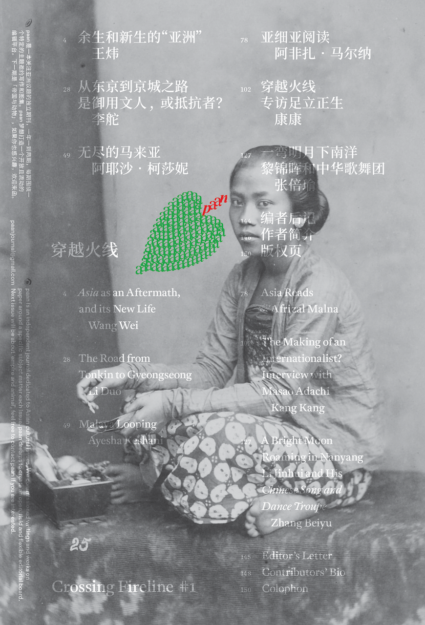
pic. 1 — Poster announcement for paan. ![]()
pic. 2 — Logo for paan in the shape of a betel nut leaf. 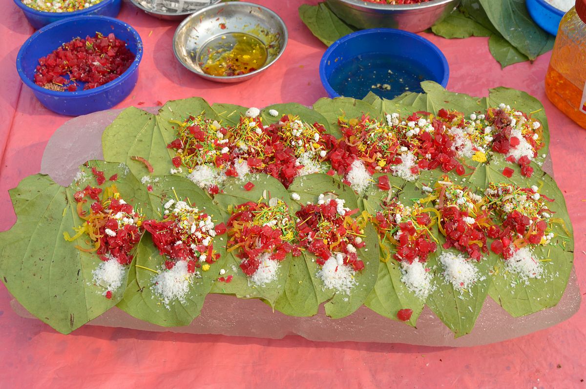
pic. 3 — “paan” is the Indonesian word for betel nut, a common snack in Southeast Asia. The logo design of paan is inspired by the way street vendors prepare the delicacy when selling it. This way of layering the ingredients is common on the streets of some Southeast Asian countries where saving “counter space” is essential.
10.03.2563, ไทรม้า, นนทบุรี
วิน ชนกประสิทธิ์ (วิน) — เมื่อไหร่ที่งานถือว่าเสร็จ?
16.03.2563, บีทีเอสอ่อนนุช, กรุงเทพฯ
เพียนเพียน เหอ (เพียนเพียน) และ แมกซ์ ฮาร์วีย์ (แมกซ์) — เสร็จในแง่ที่ว่าอยู่ในสถานะที่เสร็จสมบูรณ์ใช่ไหม? เราสองคนคิดว่ามันมีได้หลายความหมาย สำหรับบางคน มันคือช่วงเวลาตอนที่งานแข็งแรงพอที่จะเอาไปเสนอลูกค้า แต่บางคนอาจจะเป็นตอนที่งานผ่านการแอฟพรูฟ หรือส่งมอบแล้ว หรือได้ค่าจ้างแล้ว ส่วนใหญ่เรามักได้ยินคนถามคำถามนี้กับศิลปิน โดยเฉพาะอย่างยิ่งพวกจิตรกร “เมื่อไหร่ที่งานถือว่าเสร็จ?” สำหรับนักออกแบบแล้ว คำตอบง่ายๆ เลยคือถึงเดดไลน์เมื่อไหร่ก็เมื่อนั้น ติ๊ก ต๊อก
เมื่อไหร่ที่งานเสร็จเหรอ? เราไม่รู้จะตอบคำถามนี้เป๊ะๆ ยังไง ส่วนหนึ่งน่าจะเป็นจากสัญชาตญาณ แต่ในโปรเจกต์หนึ่งๆ ไม่ว่าจะเป็นงานคอมมิชชั่นหรืองานที่คุณทำเอง คุณจะพยายามไปให้ถึงเป้าบางอย่างที่ตั้งไว้ ซึ่งมักเกี่ยวกับการคอนโทรล ตอนนี้เรามีปัญหากับคำๆ นี้มากๆ เรากำลังออกแบบวารสารรายครึ่งปีชื่อ paan เป็นข้อเขียนเกี่ยวกับวัฒนธรรมเอเชียตะวันออกเฉียงใต้ เล่มแรกชื่อ Crossing Fire-line จะมีบทความที่เขียนให้เฉพาะเล่มนี้อยู่ 4 เรื่อง ซึ่งบรรณาธิการ เจิ้งเจียหู เป็นคนคอมมิชชั่น ในเล่มยังมีงานความเรียงภาพ (photo essays) และบทกวีอีก 7 บท เนื้อหาทั้งหมดมีอย่างน้อยสองภาษา หลักๆ คือจีนและอังกฤษ เราทำโปรเจกต์นี้มาปีครึ่งแล้ว ที่มันช้ากว่ากำหนด ส่วนหนึ่งเพราะงบไม่สมเหตุสมผลสำหรับการออกแบบสิ่งพิมพ์หลายภาษา แต่อีกส่วนหนึ่งเป็นเพราะเราเจอความล่าช้าจากการผลิต แล้วก็จากปัญหาการเมืองด้วย เราเคยประกาศว่าโปรเจกต์นี้จะเสร็จช่วงธันวาคมที่ผ่านมา แต่ว่าเนื้อหาของสิ่งพิมพ์กลายเป็นสัญญาณเตือนไปยังผู้จัดพิมพ์ที่ทำปรู๊ฟเล่มพิมพ์ (wet proof) กับเล่มดัมมี่ของ paan ไปสองสามเล่มแล้ว ถึงโรงพิมพ์จะไม่รู้ว่าวารสารเล่มนี้เกี่ยวกับอะไร แต่ดูเหมือนพวกเขาคิดว่าเนื้อหามัน “ล่อแหลมเกินไป” นี่หมายถึงถ้ามองแวบแรก เนื้อหาในเล่มไม่ดูมองโลกในแง่ดี คุณภาพของภาพและภาษาที่ใช้ทำให้จีนดูไม่ดีเท่าไหร่ อย่างไรก็ตาม วารสาร paan ไม่ได้มีเนื้อหาอะไรเกี่ยวกับการที่จีนเข้าแทรกแซงในอะไรเลย แต่มีเนื้อหาเจาะประเด็นเกี่ยวกับผู้คนและการเมืองยุคหลังสงครามในเอเชีย รวมถึงย้อนดูช่วงเวลาสำคัญๆ ในประวัติศาสตร์สังคมเอเชียที่เพิ่งผ่านมา พอดูเล่มทดลองพิมพ์แล้วมีปัญหา มันก็เลยเกิดขึ้นไม่ได้ เรามีงบพอจะพิมพ์วารสารเล่มนี้ แต่คนที่เราคุยงานด้วยที่โรงพิมพ์กลับไม่เต็มใจที่จะไปต่อ เพราะกลัวจะมีปัญหาตามมาทีหลัง อาทิตย์ถัดมา โรงพิมพ์อื่นๆ ก็ตอบมาคล้ายๆ กัน ครั้งนึงเคยมีคนบอกเราว่า “แคตตาล็อกงานหรือภาพวาดน่ะพิมพ์ให้ได้ แต่งานเธอน่ะ ตัวหนังสือมันเยอะไป”
นี่เป็นตัวอย่างของโปรเจกต์ที่เราไม่มีอำนาจเบ็ดเสร็จในการคอนโทรลผลลัพธ์ ทุกส่วนที่เกี่ยวข้องกำลังทำงานบนจุดหมายเดียวกันโดยไม่พยายามกดดันตัวเองด้วยการตั้งเดดไลน์ที่จะวกกลับมาทำร้ายตัวเอง เนื่องจากการผลิตสิ่งพิมพ์มาถึงจุดที่คนหลายคนในทีมเริ่มตั้งคำถามถึงความเกี่ยวข้องของพวกเขาในงาน เราเลยยิ่งต้องระวังเรื่องแนวคิด โดยเฉพาะอย่างยิ่งในวารสารเล่มนี้ ปีนี้เป็นปีที่เราทำงานแล้วเจอเรื่องยากๆ มากที่สุด ทั้งงานไม่เสร็จ งานล่าช้า และล่าสุดที่เพิ่งเข้ามาขัด ก็คือเรื่องไวรัสโคโรน่า
“เป็นช่วงเวลาที่ประหลาดมาก” ทุกคนพูดแบบนี้
เราคิดว่าเป้าหมายคือปล่อยให้ตัวเองทำงานที่มองแล้วอาจจะรู้สึกว่ายังไม่เสร็จสมบูรณ์ หรืองานที่จบด้วยคนอื่นได้
รูป 1 — โปสเตอร์เปิดตัววารสาร paan![]()
รูป 2 — โลโก้ paan ออกเแบบเป็นทรงใบพลู
รูป 3 — “paan” คำภาษาอินโดนีเซียแปลว่าหมากพลู ของขบเคี้ยวที่พบทั่วไปในเอเชียตะวันออกเฉียงใต้ โลโก้ได้แรงบันดาลใจจากหาบเร่ริมทางที่เตรียมหมากขายเป็นคำๆ วิธีการเรียงวัตถุดิบเป็นชั้นๆ นี้พบได้ทั่วไปบนท้องถนนในบางประเทศในเอเชียตะวันออกเฉียงใต้ ที่ซึ่งการประหยัด “พื้นที่ตั้งแผง” เป็นเรื่องจำเป็น
10.03.2020, Sai Ma, Nonthaburi
WS — You have used graphic design as a point of collaboration with people from different fields of practice. Can you describe the differences, commonalities, or things you found surprising about doing graphic design with artists, museums, anthropologists, writers, etc.?
16.03.2020, On Nut BTS, Bangkok
PH & MH — Speaking of commonalities, conversations are always the most important, but you need to find at last a collaborator who is willing to converse. That ain’t easy. Through conversations you have a better understanding of your role in the project. Ultimately, you can find someone whose attitude is close to yours. Here in China, the general vibe is that employers have very little patience with graphic designers and since turnarounds are extremely fast, things can get out of hand very quickly. For example, it is not uncommon to be asked to design and implement an exhibition in 3 weeks time. We remember while in the United States doing a relatively small book for a period of around 10 months. That’s a stark contrast. If all the parties involved in the book-making process are all immersed and very meticulous in their work, the project’s timeline can stretch for long. In China, it is a little bit different. It has to do with this culture of “moving forward” and get it done, as “done” being more important than “it”. However, working with us is to automatically sail against this mindset. We usually make things more complicated than they are and we do them rather slowly. We do not do it on purpose, but it might be perceived as such. We like to analyze the content of a project before we go forward. It is necessary to approach it in this way. Usually, where clients see smooth sailing, we see rocky hills, with lots of potential problems and ultimately contradictions.
I don’t think we pay too much attention on those overlaps between the different professions we see. When things go well, work usually just goes forward, we do not really spend too much time formulating, after the fact, why it went well. You basically want to call your collaborators your friends. There were certainly rugged moments but we don’t want to tell the tale.
10.03.2563, ไทรม้า, นนทบุรี
วิน — คุณทำงานออกแบบกราฟิกร่วมกับคนจากสาขาอาชีพอื่นๆ ช่วยอธิบายความแตกต่าง ความเหมือน หรือสิ่งที่ทำให้คุณประหลาดใจเวลาทำงานร่วมกับศิลปิน พิพิธภัณฑ์ นักมานุษยวิทยา หรือนักเขียนได้มั้ย?
16.03.2563, บีทีเอสอ่อนนุช, กรุงเทพฯ
เพียนเพียน และ แมกซ์ — ถ้าพูดถึงความเหมือน การพูดคุยคือสิ่งสำคัญที่สุดเสมอ แต่สุดท้ายคุณก็อยากทำงานร่วมกับคนที่เต็มใจจะพูดคุยกับคุณด้วยนะ และนั่นไม่ง่ายเลย เวลาที่คุย คุณจะเข้าใจบทบาทของคุณในโปรเจกต์ได้ดีขึ้น ถึงที่สุด คุณจะเจอคนที่มีทัศนคติใกล้เคียงกับคุณ ที่จีนความรู้สึกทั่วๆ ไปคือ นายจ้างจะไม่ค่อยยอมรอนักออกแบบกราฟิก และเนื่องจากรอบการครบวงงานแต่ละครั้งคือเร็วมากๆ สิ่งต่างๆ จะพ้นจากมือเราไปอย่างรวดเร็ว ยกตัวอย่างง่ายๆ ไม่ใช่เรื่องผิดปกติเลยที่จะโดนขอให้ออกแบบและติดตั้งนิทรรศการภายใน 3 สัปดาห์ เราจำได้ว่าตอนยังอยู่ที่อเมริกาทำหนังสือเล่มไม่ใหญ่มาก เล่มหนึ่งยังมีเวลาตั้งเกือบ 10 เดือน เวลามันต่างกันมาก ยิ่งถ้าทีมงานที่เกี่ยวข้องทั้งหมดทุ่มเทและทำงานของตัวเองอย่างละเอียด ไทม์ไลน์ของโปรเจกต์ก็จะยืดออกไปอีก วัฒนธรรมในจีนนั้นต่างออกไป ตรงที่มันเกี่ยวกับการ “ไปข้างหน้า” และการทำมันให้เสร็จ โดยการทำให้ “เสร็จ” สำคัญกว่า “มัน” แต่การทำงานกับพวกเราไม่เป็นแบบนั้นนะ เราตั้งใจมองงานให้ละเอียดลึกซึ้ง และทำงานค่อนข้างช้า เราไม่ได้ตั้งใจจะถ่วงเวลา แต่มันจำเป็น เราชอบวิเคราะห์เนื้อหาของโปรเจกต์ก่อนทำงานต่อ ส่วนใหญ่ถ้าลูกค้าเห็นว่างานกำลังแล่นไปอย่างราบรื่น เราจะเห็นโขดหิน เห็นอุปสรรคต่างๆ ที่อาจเกิดขึ้น และท้ายที่สุดคือเห็นข้อขัดแย้งในงาน
เราไม่สนใจความคาบเกี่ยวบนความต่างระหว่างสาขาอาชีพเท่าไหร่ ถ้าสิ่งต่างๆ เป็นไปด้วยดี งานก็แค่เดินไปข้างหน้า เราไม่ค่อยเสียเวลาหาสูตรในการทำงาน หรือมานั่งหาว่าทำไมงานเดินไปด้วยดี เหมือนคุณแค่อยากเรียกทุกคนที่คุณทำงานด้วยว่าเพื่อนได้ มันมีช่วงเวลาแย่ๆ ยากๆ แหละ แต่เราไม่อยากเล่า
16.03.2020, On Nut BTS, Bangkok
PH & MH — What is your take on that? Do you recall any anecdotes?
18.04.2020, Sai Ma, Nonthaburi
WS — No specific anecdotes, but I have observed that the nature of design work and collaboration becomes different depending on the professional worlds the design was called for. It would be too easy to reduce the differences into dichotomies of work that is created for personal, non-market driven pursuits versus work that must function in very specific business driven contexts. Neither is ultimately good nor bad in my opinion, and truthfully I am aware that the two contexts in fact do bleed into one another more often than not.
It is super interesting that you mentioned the differences in production timelines between China and the United States—how each is working and living with very different comprehension of what fast means. Or what normality means for that matter.
Usually when there is limited time and money, it is logical to optimize the amount of resources you put into a project, whether that resource might be time, number of revisions, or the critical examination of the project scope. The latter is what I think is the most valuable thing a designer can offer to the table. Financial sustainability is absolutely important to the longevity of a design practice, but I believe it is also absolutely important that we “bother” our collaborators with challenges, questions, and thoughts on their given prompt. I try, and I’m not sure if I always succeed, to do this with all my collaborators, no matter if the work is “market-driven” or not.
16.03.2563, บีทีเอสอ่อนนุช, กรุงเทพฯ
เพียนเพียน และ แมกซ์ — แล้วคุณทำยังไง มีอะไรอยากแชร์บ้างมั้ย?
18.04.2563, ไทรม้า, นนทบุรี
วิน — ไม่ได้มีอะไรเป็นพิเศษนะ แต่ผมสังเกตว่าธรรมชาติของการออกแบบและการร่วมมือจะต่างกันไปขึ้นตามแต่ละอาชีพที่งานออกแบบถูกเรียกตัวไป อาจจะง่ายเกินไปที่จะลดทอนความแตกต่างลงเหลือเป็นแค่การแบ่งขั้วตรงข้าม ระหว่างงานที่ทำขึ้นส่วนตัวแบบไม่สนใจตลาด กับงานที่ต้องมีฟังก์ชั่นในบริบทธุรกิจแบบเฉพาะเจาะจง ผมคิดว่าไม่มีอะไรดีหรือแย่ที่สุด และจริงๆ แล้ว ผมเองก็รู้ว่าทั้งสองบริบทก็ถ่ายโอนกันไปมาบ่อยๆ ด้วยซ้ำ
มันน่าสนใจมากๆ ที่คุณพูดถึงความแตกต่างเรื่องไทม์ไลน์ในการทำงานระหว่างที่จีนกับที่อเมริกา ว่าคนทั้งสองประเทศทำงานและใช้ชีวิตบนความเร็วที่ต่างกันมากยังไง หรือความเข้าใจเรื่องอะไรคือความปกติ และมันมีความหมายยังไง
ปกติถ้ามีงบหรือเวลาจำกัด ก็มีเหตุผลที่จะบริหารจัดการทรัพยากรที่คุณลงไปในโปรเจกต์ ไม่ว่าจะเป็นเวลา จำนวนครั้งของการปรับแก้ หรือการวิเคราะห์สโคปของงาน อันหลังสุดนี้ผมคิดว่าเป็นสิ่งที่มีค่าที่สุดที่นักออกแบบสามารถเสนอกลับไปบนโต๊ะได้ การจะทำงานออกแบบต่อไปได้นานแค่ไหนนั้น ความยั่งยืนทางการเงินเป็นสิ่งสำคัญ แต่ผมเชื่อว่าที่สำคัญไม่แพ้กันคือเราต้อง “กวนใจ” คนที่เราร่วมงานด้วยความท้าทาย ด้วยคำถาม และด้วยความคิดต่อสิ่งที่เขามี และผมไม่แน่ใจว่าผมประสบความสำเร็จในการทำสิ่งนี้มั้ยทุกครั้งกับทุกคนที่ผมทำงานด้วย ไม่ว่างานนั้นๆ จะ “ถูกขับเคลื่อนโดยตลาด” หรือไม่ก็ตาม
10.03.2020, Sai Ma, Nonthaburi
WS — Describe your background.
16.03.2020, On Nut BTS, Bangkok
PH — I’m from China, and I studied visual communication as an undergrad in my hometown Changsha. There were only two choices back then in the Chinese art school system, you can either choose from fine arts or design. I was interested in art and film, but didn’t want to be an artist nor a filmmaker. Design also seemed a bit “fancy” to me, I was very suspicious of it when I started my studies. The most common design works one would be acquainted to were pieces of advertising and products.
Famous Chinese designers normally would have two kinds of portfolios: personal and commercial. I did an internship at a design studio ran by a famous Chinese graphic designer, but I was bored there, because most of the works we were doing were for pharmaceutical companies, mostly packagings. Good thing I made really good friends who were at the time studying graphic design at the RCA in London. Around the same time, I started doing some research about art schools outside of China. Information was limited since Google, YouTube, Instagram are all blocked in the mainland. I spent ages online using free but terribly slow VPN softwares, and from that I got to know the graphic design program at Yale.
In 2013, I met Max who just moved from Canada to China and we started working together. Meanwhile, I did some projects that were on the edge of art and design, but didn’t really show them to anyone. My design education back then taught me design is about problem solving, people were into visual identity projects, Kenya Hara and Muji, or focused on the promotion of the potential symbiosis between the traditional Chinese cultural and the business sector. Therefore, I knew people would think my projects were of no use.
In 2015, I got into the MFA program at Yale. It’s interesting whereas at Yale, the attitude is the absolute opposite of my undergrad, I almost just continued doing those weird in-between projects, but with better support. It gives you confidence.
MH — I quite agree with what Pianpian is saying up there, I do believe certain personalities cannot advance in certain environments, it depends on how you are wired. Certain environments are your complete opposite. It is always worth seeking for that space where you feel you can grow a little more. Or you find the place that can enable you to re-wire, but you have to experiment a little.
As for my background: I am a teacher in Hunan Normal University and I also run a studio with Pianpian in Changsha, China. I was born in Rivière-du-loup (Québec), Canada. I really dislike cars, it’s astonishing that in 2020 we still have to stop at gas stations to fuel a tank.
10.03.2563, ไทรม้า, นนทบุรี
วิน — ช่วยเล่าแบ็คกราวน์ของคุณให้ฟังหน่อย
16.03.2563, บีทีเอสอ่อนนุช, กรุงเทพฯ
เพียนเพียน — ฉันมาจากจีน จบปริญญาตรีสาขาออกแบบนิเทศศิลป์ (visual communication) จากเมืองฉางชาบ้านเกิด ระบบโรงเรียนศิลปะในจีนตอนนั้นมีตัวเลือกแค่สองทาง คุณเลือกได้แค่ว่าจะเรียนวิจิตรศิลป์หรือจะเรียนการออกแบบ ตอนนั้นฉันสนใจศิลปะและภาพยนตร์ แต่ไม่ได้อยากเป็นศิลปินหรือคนทำหนัง เอาจริงๆ สาขาการออกแบบก็ดูจะ “แฟนซี” ไปหน่อย ฉันก็มีข้อสงสัยอยู่ตอนที่เริ่มเรียน งานออกแบบที่เห็นได้ทั่วไปที่สุด ที่คนธรรมดาคนหนึ่งจะคุ้นเคยได้ คืองานออกแบบโฆษณาและงานออกแบบผลิตภัณฑ์
นักออกแบบจีนที่มีชื่อเสียงส่วนมากจะมีพอร์ตสองแบบ พอร์ตงานส่วนตัว แล้วก็พอร์ตงานคอมเมอร์เชี่ยล ฉันเคยฝึกงานที่สตูดิโอนักออกแบบกราฟิกจีนที่ดังมากคนนึง คือตอนฝึกงานก็เบื่อมาก เพราะว่างานส่วนใหญ่ที่ได้ทำคือการออกแบบบรรจุภัณฑ์ให้กับบริษัทยา แต่ก็มีเรื่องดีอยู่ คือได้เพื่อนที่เรียนออกแบบกราฟิกอยู่ที่อาร์ซีเอ (RCA หรือ Royal College of Art) ในลอนดอน จากนั้นฉันก็เริ่มหาข้อมูลเรื่องโรงเรียนศิลปะนอกประเทศ ข้อมูลที่หาได้จำกัดมาก เพราะกูเกิล ยูทูป อินสตาแกรม ถูกบล็อกในจีน ส่วนใหญ่ฉันท่องเน็ตผ่าน VPN ที่ถึงจะฟรีแต่ก็ช้ามากๆ ก่อนมาเจอกับคอร์สออกแบบกราฟิกที่เยล
ปี 2556 ฉันพบกับแมกซ์ที่เพิ่งย้ายมาจากแคนาดา พอเราเริ่มทำงานด้วยกัน ฉันก็ทำงานส่วนตัวไปด้วย งานบางงานก็คาบเกี่ยวระหว่างศิลปะและงานออกแบบ แต่ไม่ได้โชว์งานให้ใครดูแบบจริงจังความรู้เรื่องการออกแบบของฉันตอนนั้นคือ ฉันถูกสอนว่าการออกแบบคือการแก้ปัญหา คนมักจะสนใจแต่โปรเจกต์งานออกแบบอัตลักษณ์ อย่างงานที่เคนยะ ฮาระ ทำให้มูจิ หรืออีกทีก็การหาวิธีการออกแบบวัฒนธรรมจีนให้ไปได้กับภาคธุรกิจ เพราะอย่างนั้น ฉันเลยรู้ว่าคนจะมองงานแบบของฉันว่าไม่มีประโยชน์
พอถึงปี 2558 ฉันไปเรียนปริญญาโทที่เยล น่าสนใจมากว่า ทัศนคติในการทำงานออกแบบที่นั่นตรงกันข้ามกันกับสมัยที่เรียนปริญญาตรี ฉันแค่ทำงานออกแบบแปลกๆ ส่วนตัวต่อไป แต่คราวนี้กลับได้รับการสนับสนุนที่ดีขึ้น นั่นทำให้คุณมั่นใจกับสิ่งที่คุณทำ
แมกซ์ — ผมค่อนข้างเห็นด้วยกับที่เพียนเพียนเล่า ผมเชื่อว่าบุคลิกภาพบางแบบไม่อาจเติบโตได้ในสภาพแวดล้อมบางอย่าง มันขึ้นกับว่าคุณถูกวางระบบในชีวิตมายังไง สภาพแวดล้อมบางอย่างก็ตรงกันข้ามกับตัวตนคุณโดยสิ้นเชิง มันคุ้มค่าถ้าคุณจะลองหาที่ๆ คุณรู้สึกว่าคุณได้โตขึ้นอีกนิด หรือที่ๆ เอื้อให้คุณวางระบบตัวเองขึ้นได้ใหม่ แต่คุณต้องทดลองมากขึ้นอีกหน่อยถ้าอยากจะทำอย่างงั้น
สำหรับผม ผมเป็นอาจารย์ที่มหาวิทยาลัยหูหนานนอร์มอล แล้วก็ทำงานสตูดิโอกับเพียนเพียนที่ฉางชา ผมเกิดที่เมืองริเวียร์-ดู-ลูปในรัฐควีเบก แคนาดา ผมไม่ชอบรถมากๆ ประหลาดมากที่ตอนนี้ปี 2563 แล้วแต่เรายังต้องไปเติมน้ำมันที่ปั๊มอีก
About Win Shanokprasith.
Win Shanokprasith is a Bangkok-based, Thai graphic and UX designer. He was born and raised in Bangkok, but had also spent a number of years in Baltimore and New York where he studied painting and worked various jobs (some of which pertain to graphic design while others completely unrelated). His background in painting somehow informs his design practice in very strange and haphazard ways—all of which he enjoys. Win currently holds a full-time position at a large tech company based in Nonthaburi. Whenever he’s not doing that, he’s engaged in projects and conversations with BANGKOK CITYCITY GALLERY.
เกี่ยวกับ วิน ชนกประสิทธิ์
วิน ชนกประสิทธ์ เป็นนักออกแบบกราฟิกและออกแบบ UX เกิดและโตที่กรุงเทพฯ แต่ใช้เวลาหลายปีที่บัลติมอร์และนิวยอร์ก ที่เขาเรียนด้านจิตรกรรมและมีโอกาสได้ทำงานต่างๆ (บางงานที่ทำก็เกี่ยวกับการออกแบบกราฟิก แต่บางงานก็ไม่เกี่ยวเลย) พื้นฐานการเรียนด้านจิตรกรรมทำให้การออกแบบกราฟิกของวินทั้งแปลกและไม่ได้เป็นไปตามแบบแผน ซึ่งเขาสนุกกับทำงานมาก ทุกวันนี้ วินทำงานประจำในบริษัทด้านเทคโนโลยีขนาดใหญ่ในนนทบุรี นอกเหนือจากงานประจำ เขาออกแบบงานกราฟิกต่างๆ ให้กับบางกอก ซิตี้ซิตี้ แกลเลอรี่ และสนุกกับการแลกเปลี่ยนความคิดกับผู้คนที่แกลเลอรี่
10.03.2020, Sai Ma, Nonthaburi
WS — What is graphic design to you? How do you use graphic design in your life? Would you say that your idea of graphic design is different from what you think other people would think of the field?
27.03.2020, Changsha, Hunan
PH & MH — Graphic design is actually as much a part of society as any other discipline. Pianpian admires filmmaker Chris Marker, who likes to refer to himself as an amateur filmmaker. This amateur attitude is also actually saying, don’t go into your profession with the mindset that you know everything, because then you are not likely to move forward. It also involves the fact that our work with different types of creators is actually a learning process. Every time we get a new design project it is as if we’re facing a new subject, or walking into an exhibition that someone else curated, or diving into an article that someone else wrote, etc. You try to get the meaning behind it and find a right tone, and eventually express that understanding with suitable visuals and writings. It’s an interdisciplinary job, and that’s why we love it.
Graphic design itself has already evolved into something else. Designers can be artists, writers, curators, editors, it allows us to see other futures for graphic design. It’s also possible that eventually more young people will choose graphic design as a career, as well as being creators of positive content. We also hope to see these kinds of developments in China as well, as there is no such scope for graphic design over there at this time, there is little interaction between different disciplines and the expression “graphic design” is almost derogatory.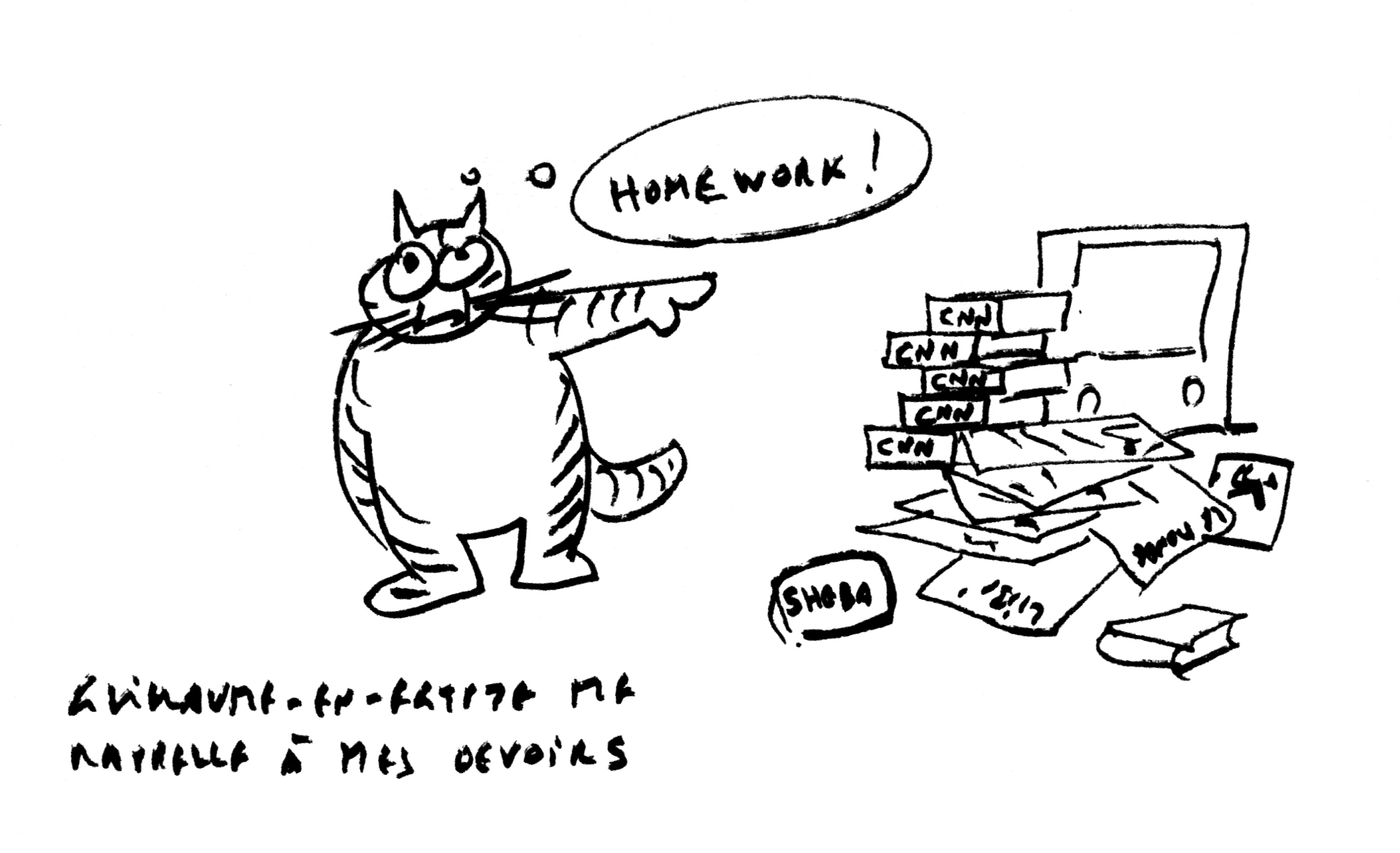
pic. 4 — Chris Marker’s cat Guillaume is urging him to get back to work.
10.03.2563, ไทรม้า, นนทบุรี
วิน — งานออกแบบกราฟิกมีความหมายสำหรับคุณยังไง? คุณใช้มันในชีวิตประจำวันยังไง? พูดได้มั้ยว่าไอเดียงานออกแบบกราฟิกของคุณ ต่างจากสิ่งที่คุณคิดว่าคนอื่นๆ คิดถึง เวลาพูดถึงสายงานนี้?
27.03.2563, ฉางชา, หูหนาน
เพียนเพียน และ แมกซ์ — ที่จริงงานออกแบบเป็นส่วนหนึ่งของสังคมไม่ต่างจากศาสตร์อื่น เพียนเพียนชื่นชมนักทำหนังที่ชื่อคริส มาร์กเกอร์ เขาชอบพูดว่าตัวเองเป็นนักทำหนังมือสมัครเล่น และทัศนคติความเป็นมือสมัครเล่นแบบนี้กำลังบอกว่า จงอย่าทำงานด้วยทัศนคติว่าคุณรู้ทุกอย่าง เพราะไม่งั้นคุณจะย่ำอยู่กับที่ นี่ยังเกี่ยวกับความจริงที่ว่า งานที่เราทำร่วมกับนักสร้างสรรค์คนอื่นๆ ก็เป็นกระบวนการการเรียนรู้ เวลาที่เราได้โปรเจกต์ใหม่มา เหมือนว่าเรากำลังเผชิญหน้ากับเรื่องใหม่ๆ ทุกครั้ง หรือกำลังเดินเข้าไปชมนิทรรศการที่คนอื่นเป็นคนคิวเรท หรือกำลังดำดิ่งลงไปในบทความที่ใครสักคนเขียนขึ้น คุณพยายามหาความหมายเบื้องหลัง และหาโทนหนึ่งๆ ที่ถูกต้องให้ และท้ายที่สุดแสดงความเข้าใจในงานนั้นๆ ด้วยภาพและภาษาที่เหมาะสม มันเป็นงานสหศาสตร์ และนั่นทำให้เรารักมัน
งานออกแบบกราฟิกสามารถพัฒนาไปเป็นสิ่งอื่นได้ นักออกแบบสามารถเป็นศิลปิน เป็นนักเขียน เป็นภัณฑารักษ์ เป็นบรรณาธิการ มันเปิดให้เราเห็นอนาคตต่างๆ มากมายของงานออกแบบกราฟิก ท้ายที่สุดแล้ว เป็นไปได้ว่าคนรุ่นใหม่จะเลือกเป็นนักออกแบบกราฟิกมากขึ้น และเลือกเป็นนักสร้างสรรค์เนื้อหาในเชิงบวกมากขึ้นเช่นเดียวกัน เรายังหวังว่าจะได้เห็นพัฒนาการนี้ด้วยเช่นกันในจีน เพราะมันไม่ได้มีสโคปงานออกแบบกราฟิกที่ชัดเจนตอนนี้ในจีน การทำงานร่วมกันระหว่างศาสตร์หรือสาขาต่างๆ เกิดขึ้นน้อยมาก และคำว่า “งานออกแบบกราฟิก” มักจะถูกมองในแง่ลบเสียด้วยซ้ำ
รูป 4 — กิโยม แมวของ คริส มาร์กเกอร์ กำลังกระตุ้นเขาให้กลับไปทำงาน
18.04.2020, Sai Ma, Nonthaburi
WS — “Finding a right tone”. I like that you chose the words “a right tone” rather than “the right tone”, by which I agree that there is never a singular objective solution to a design problem. Nor do I think there should be one! An outcome is just a possibility, a version of a translation of the given content problem.
10.03.2020, Sai Ma, Nonthaburi
WS — Describe your practice.
20.03.2020, Suvarnabhumi Airport, Bangkok
PH & MH — What we are looking for is fever, tiredness, dry cough, aches and pains, nasal congestion, runny nose, sore throat, shortness of breath, and perhaps even anosmia. The paranoia is palpable.
18.04.2563, ไทรม้า นนทบุรี
วิน — “หาโทนหนึ่งๆ ถูกต้องให้” ผมชอบที่คุณใช้คำว่า “โทนหนึ่งๆ ที่ถูกต้อง” มากกว่าคำว่า “โทนที่ถูกต้อง” ผมเห็นด้วยว่าไม่เคยมีการแก้ปัญหาแบบเดียวหรืออย่างเดียวกับปัญหาเชิงออกแบบ และผมไม่คิดว่าควรมีการแก้ปัญหาแบบนั้นด้วย ผลลัพธ์เป็นแค่ความเป็นไปได้ เป็นแค่เวอร์ชั่นนึงของการแปลเนื้อหาโจทย์ที่ได้รับ
10.03.2563, ไทรม้า นนทบุรี
วิน — ช่วยอธิบายการทำงานของคุณตอนนี้ให้ฟังหน่อย
20.03.2563, สนามบินสุวรรณภูมิ, กรุงเทพฯ
เพียนเพียน และ แมกซ์ — เรากำลังรอดูอยู่ว่าจะเป็นไข้ รู้สึกเหนื่อย ไอแห้งๆ ปวดเมื่อยตามตัว คัดจมูก น้ำมูกไหล เจ็บคอ หายใจหอบถี่ และอาจจะจมูกไม่ได้กลิ่นด้วยรึเปล่า เอาเป็นว่าพารานอยด์มาก
10.03.2020, Sai Ma, Nonthaburi
WS — What are ways in which aesthetics and formal qualities of graphic design can be used to add value to the “stuff” graphic design is giving form to? What are ways in which processes and human communication can be used to add value to the “stuff” graphic design is giving form to? What about the subversion of said “stuff”? What is the value of subversion?
16.03.2020, On Nut BTS, Bangkok
PH & MH — Perhaps using a book we completed last year would illustrate but not answer that question in the fullest.
ArtDBL is a local (Shenzhen) art media outlet founded in 2015 that uses an online platform as a means of distribution. The content they cover is unique, the language is different from many other Chinese news platforms, and they have gained a considerable audience in just a few years. One of the most common platforms they use is WeChat, the most popular mobile app in China, which has a user base of almost one billion people and functions in many aspects of people’s lives: work, friend-making mobile payment, and publishing. In WeChat, there is a function called “Moments”, where you can see stories and posts coming from your friends’ circle. The app also offers a public account feature that gives businesses, organizations, and individuals the right to “publish”. You can apply for such a public account to post articles, promote a product, or write a private diary, etc. Of course, you are nonetheless monitored by the Party at all times, because, well, that’s what it does. So, if you are not careful, your account can be instantly deleted without any notice.
Our friend of ours referred us to ArtDBL in early 2019 and they came with the idea of compiling into a printed book all of the texts already published on their online platform. The texts are about the historical character of the city of Shenzhen in relationship to its local art scene. The title of the book translates into Shenzhen Dizziness, and we would like to copy here an excerpt of the foreword, which was written by the editor, Zhong Gang:
Shenzhen is a city whose multidimensionality deserves to be contemplated and researched. In this heterogeneous metropolis where a mixture of gambling style governance and global economy unite as one, time and space expand and collapse. All-encompassing and under the pressure of constant growth, the city evolves and lays bare its structures to the observer.
Unmistakably, the developments of the arts could not evade the “need-for-speed” model that is deeply rooted in the logic of the city. Fast paced economic growth, outsourced production, duplication, air freight and maritime transportation, along with the other sequelae investigated in this book, all emerge as the symptoms of the last 30 years of progress.
Looking at Shenzhen from a political and economical standpoint, we can consider it as being “particular”. We can also examine how this “particularity” contributed to boost the city’s mode of development from an art perspective. Shenzhen isn’t your typical art metropolis in comparison to well-established, or say, traditional cultural hubs: it is relentlessly growing and mutating. With the influence of the heavily promoted Hong Kong Art Basel and its strong market stimulation, Shenzhen itself has become a burgeoning art market. Once tranquil, then suddenly frantic under the presence of the art biennale, and then shifting again towards more diversified ways of art making, Shenzhen’s artistic production has been gradually shining overseas while nevertheless being modeled and carried away by capital.
What we found really interesting in this book is how personal each account of the city is. It illustrates well how several artists have been dealing with the city, and how they navigate their art practice within it. There is also a clear awareness that, thus far, Shenzhen’s art scene isn’t like Beijing nor Shanghai.
The text in the book is set in a font size larger than those in most Chinese paperbacks, we have done so to make the reader feel a bit uneasy, but this is not a case for purposefully impending legibility. Books in China published by regular Chinese publishers are more or less all typeset the same way, at similar sizes, and with rather crazy wide leadings (granted that Chinese is perhaps easier to read with a larger leading). The arrangement of text in a page isn’t something that people want to consider. Millions of books have their text typeset in the same way – as long as the text is comfortable to read, nothing else is needed. A lot of knowledge developed in the West about layout-making / grid-making did not transfer to China until recently. With all the digital platforms available at hand (made without typographical consideration), advocating for good typography in say, a printed novel, isn’t really going anywhere.
Printed on the cover is the two-word title “Shenzhen Dizziness”, which is composed of 4 Chinese characters 深 Shēn,圳 Zhèn,眩 Xuàn,晕 Yūn. But we have broken the title by typesetting Shēn (half of Shenzhen) and Xuàn (dizzy) in a black serif font, while Zhèn (other half of Shenzhen) and Yūn (dizzy) are set in a condensed sans-serif and printed in yellow. We automatically read by associating the font styles together, and if we do so it reads XuànShēn YūnZhèn, which means nothing specific. One has to force the reading backwards in order to read the title properly, a puzzle rather easy to solve for any Chinese readers. The funny part is that the people’s reading of the title is indeed influenced by this intentional mishap. Through this visual dislocation we echo the theme of the book. In addition to this, we also proposed to include at the end of the book a small visual archive which includes images and texts from earlier publications and articles that focus on Shenzhen’s art circle. This section wasn’t part of the original brief, but we thought that some visuals would help building a kind of registry of sorts…
The book was published last August (2019) and was sold out in less than a month – something we truly didn’t expect. Kinda nice to not only to see so much support for indie publishing from readers, but also to realize that designers can own a bit of their projects. As we see it, the value of the book itself is greater than its design, but without the design or the designer’s contribution, who puts together the content into one physical entity, it is harder to capture the essence of several scattered online articles as a whole.
pic. 5 — China, Guangdong province, Shenzhen, Dafen oil painting village, Dafen Village is one of the largest production centers for the oil painting market. 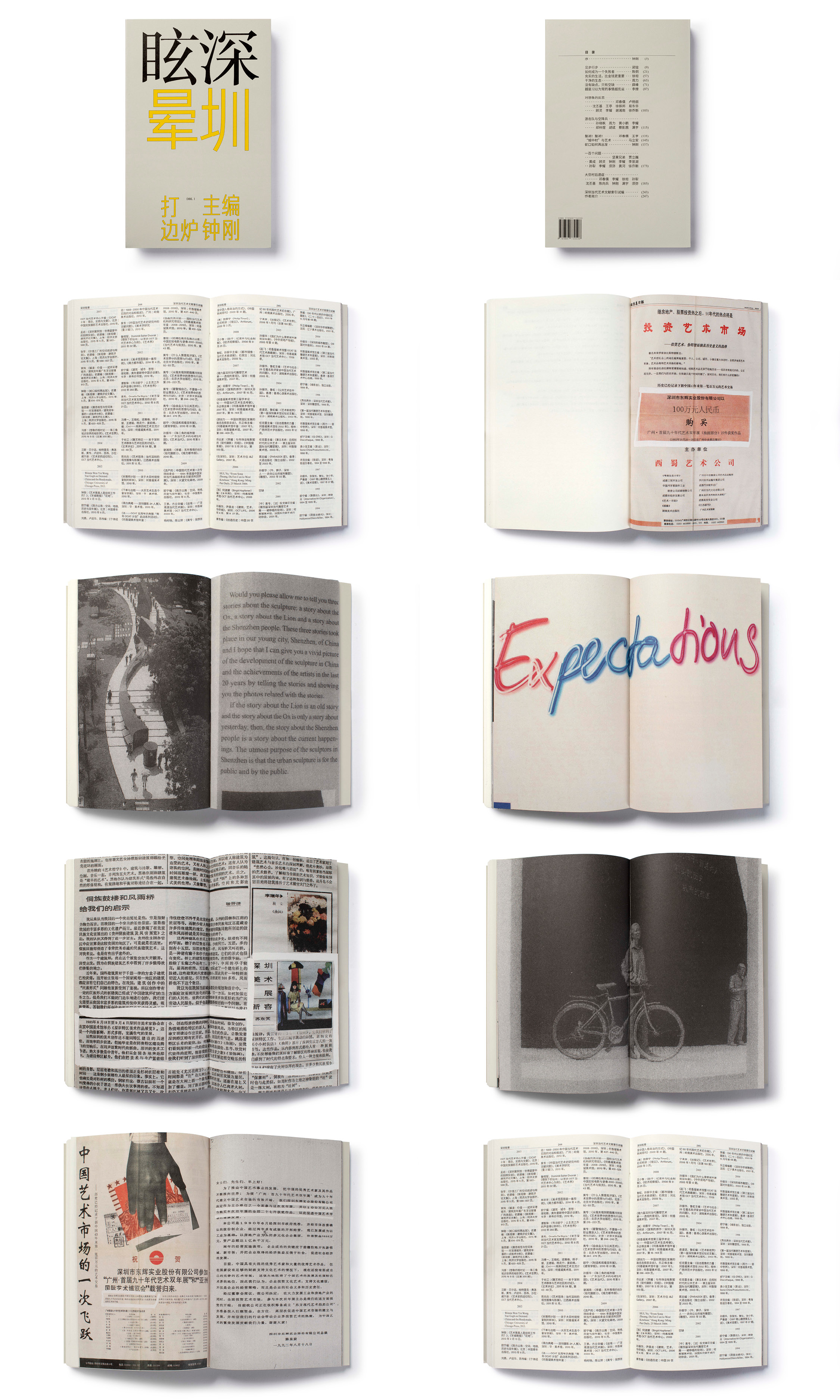
pic. 6 — Book spreads from Shenzhen Dizziness.
pic. 7 — There are five different thumbnails on the spine of the book at the location where publisher logos are usually inserted.
10.03.2563, ไทรม้า, นนทบุรี
วิน — วิถีทางสู่คุณภาพเชิงสุนทรียศาสตร์คือ? คือรูปแบบงานออกแบบกราฟิกที่ช่วยเพิ่มมูลค่าให้ “ของ”? วิถีทางที่กระบวนการการสื่อสารช่วยเพิ่มมูลค่าให้กับ “ของ” ที่งานออกแบบกราฟิกทำให้มันเป็นรูปเป็นร่างคือ? แล้วถ้าพูดถึงการล้มล้าง “ของ” เหล่านั้นล่ะ? ถ้างั้นค่าของมันคืออะไร?
16.03.2563, บีทีเอสอ่อนนุช, กรุงเทพฯ
เพียนเพียน และ แมกซ์ — บางทีถ้าอธิบายผ่านหนังสือที่เราเพิ่งทำเสร็จปีที่แล้ว อาจจะเห็นเป็นรูปธรรมมากขึ้น แต่คงตอบคำถามไม่ได้ทั้งหมด
ArtDBL (เซินเจิ้น) เป็นสื่อท้องถิ่นด้านศิลปะก่อตั้งขึ้นในปี 2558 ที่ใช้แพลตฟอร์มออนไลน์เป็นสื่อกลาง เนื้อหาที่พวกเขานำเสนอไม่เหมือนใคร ภาษาที่ใช้ก็ต่างจากแพลตฟอร์มข่าวอื่นๆ ของจีน และมีผู้ติดตามอยู่จำนวนมากพอควรภายในเวลาไม่กี่ปี หนึ่งในแพลตฟอร์มหลักๆ ที่พวกเขาใช้คือวีแชท แอปมือถือที่ป๊อปที่สุดในจีน ซึ่งมีฐานผู้ใช้งานเกือบพันล้านคนและมีฟังก์ชั่นในชีวิตของผู้คนหลายแง่มุม ไม่ว่าจะการทำงาน การหาเพื่อน การชำระเงินผ่านระบบโมบายล์ และการโพสต์ต่างๆ รวมถึงการพิมพ์ ในแอปวีแชท มีฟังก์ชั่นชื่อ “โมเมนต์” ซึ่งคุณสามารถดูสตอรี่และโพสต์ของเพื่อนๆ ได้ แอปนี้มีบริการสร้างบัญชีสาธารณะที่ให้สิทธิ์แก่ธุรกิจ องค์กร และบุคคล ในการ “โพสต์” คุณสามารถสมัครบัญชีสาธารณะเพื่อลงบทความ โปรโมทสินค้า หรือเขียนไดอารี่ส่วนตัวได้ แน่นอนคุณจะถูกมอนิเตอร์โดยรัฐตลอดเวลา เพราะว่า อืม นั่นคือสิ่งที่รัฐทำ ดังนั้น ถ้าคุณไม่ระวัง บัญชีของคุณอาจโดนลบถาวรโดยได้ไม่มีการแจ้งล่วงหน้า
เพื่อนคนนึงแนะนำเรากับ ArtDBL ช่วงต้นปี 2562 พวกเขามาพร้อมกับไอเดียอยากจะรวบรวมเนื้อหาที่เคยอัพขึ้นแพลตฟอร์มทั้งหมดเป็นหนังสือเกี่ยวกับบุคคลสำคัญในแวดวงศิลปะในท้องถิ่นตามประวัติของเมืองเซินเจิ้น ชื่อหนังสือแปลเป็นภาษาอังกฤษคือ Shenzhen Dizziness (เซินเจิ้นวิงเวียน) และเราขอก็อปข้อความที่ตัดตอนมาจากหน้าคำนำที่เขียนโดยบรรณาธิการเล่ม จ้งกัง มาให้อ่านดังนี้
เซินเจิ้นเป็นเมืองที่มีหลากหลายมิติ สมควรได้รับการพินิจพิเคราะห์และค้นคว้า ในมหานครที่ต่างคละต่างเคล้ากันนี้ ส่วนผสมของการปกครองแบบกล้าได้กล้าเสียและเศรษฐกิจระดับโลกได้รวมกันเป็นหนึ่ง เวลาและพื้นที่ได้ยืดขยายและล่มสลาย ทุกสิ่งมุ่งไปยังและอยู่ภายใต้ความกดดันของการเติบโตอยู่ตลอดเวลา เมืองพัฒนาและเปิดเปลือยโครงสร้างสู่ผู้เฝ้ามอง
ชัดเจนว่า พัฒนาการของศิลปะไม่สามารถหลีกเลี่ยงโมเดล “ความต้องการความเร็ว” ที่หยั่งรากลึกลงในตรรกะของเมืองนี้ได้ การเติบโตทางเศรษฐกิจอย่างรวดเร็ว การผลิตแบบเอาท์ซอร์ส การทำเทียม การขนส่งสินค้าและการเดินเรือ ร่วมกับผลลัพธ์ที่ตามมาอื่นๆ ที่มีการศึกษาค้นคว้าในหนังสือเล่มนี้ ทั้งหมดปรากฏขึ้นในฐานะอาการโรคของการพัฒนาที่เกิดขึ้นในช่วง 30 ปีที่ผ่านมา
เมื่อมองเซินเจิ้นจากจุดยืนทางการเมืองและเศรษฐกิจ เราอาจมองว่าเมืองมี “ความเฉพาะตัว” จากมุมมองทางศิลปะ เราสามารถสำรวจ “ความเฉพาะตัว” นี้ ว่าช่วยสนับสนุนและกระตุ้นโหมดการพัฒนาได้อย่างไร เซินเจิ้นไม่ใช่มหานครทางศิลปะแบบที่คุณคุ้นเคยเมื่อเปรียบเทียบกับศูนย์กลางทางศิลปะอื่นๆ ที่มีรากฐานแล้ว หรือเป็นศูนย์กลางเชิงวัฒนธรรมประเพณี เมืองแห่งนี้ไม่เคยหยุดเติบโตและกลายพันธุ์อยู่ตลอดเวลา ด้วยอิทธิพลจากงานฮ่องกง อาร์ต บาเซล ที่มีการประชาสัมพันธ์และการกระตุ้นตลาดศิลปะอย่างหนัก เซินเจิ้นเองได้กลายเป็นตลาดศิลปะที่กำลังมาแรง ครั้งหนึ่งเมืองเคยเงียบสงบ แต่แล้วกลับเติบโตอย่างบ้าคลั่งหลังการเกิดขึ้นของเบียนนาเล่ศิลปะ แล้วกลับเปลี่ยนไปอีกครั้งสู่การเป็นศุนย์กลางสร้างงานศิลปะที่หลากหลาย การสร้างงานศิลปะของเซินเจิ้นค่อยๆ เปล่งประกายสู่ต่างประเทศ ในขณะที่ยังคงไว้ซึ่งรูปแบบและความตื่นตาตื่นใจจากแหล่งทุน
สิ่งที่เราพบว่าน่าสนใจมากในหนังสือเล่มนี้ คือมันแสดงให้เห็นว่าศิลปินแต่ละคนจากเมืองนี้มีความเฉพาะตัวอย่างไร ว่าศิลปินหลายคนจัดการกับเมืองอย่างไร และพวกเขาสร้างและพางานศิลปะของเขาไปข้างหน้าอย่างไร หนังสือเล่มนี้ ยังเป็นสร้างความตระหนักรู้แบบที่ไม่เคยมีมาก่อนว่า แวดวงศิลปะเซินเจิ้นนั้นไม่มีอะไรเหมือนที่ปักกิ่งหรือที่เซี่ยงไฮ้เลย
ขนาดตัวอักษรของเนื้อหาในหนังสือเล่มนี้ ถูกเซ็ตให้ใหญ่กว่าขนาดตัวอักษรในหนังสือปกอ่อนภาษาจีนทั่วไป เราตั้งใจออกแบบให้รู้สึกอ่านยากนิดหน่อย แต่ไม่ได้จงใจจะโจมตีเรื่องการอ่านออกหรือไม่ออก หนังสือที่ตีพิมพ์โดยสำนักพิมพ์จีนทั่วไป ก็ตั้งถูกค่าเรียงพิมพ์ประมาณนี้ มีขนาดตัวอักษรประมาณนี้ และเว้นบรรทัดค่อนข้างห่าง (นี่อาจเป็นเพราะถ้าเว้นบรรทัดห่างจะอ่านง่ายกว่า) การออกแบบจัดหน้าไม่ใช่เรื่องที่คนคิดถึงเท่าไหร่ มีการจัดหน้าหนังสือแบบนี้หลายล้านเล่ม ตราบใดที่มันอ่านง่ายก็ไม่ต้องทำอะไร ความรู้จำพวกการทำเลย์เอาท์ / การออกแบบกริด ที่พัฒนาในโลกตะวันตกไม่ได้เข้ามาในจีนจนกระทั่งเมื่อเร็วๆ นี้ ยิ่งมีแพลตฟอร์มดิจิทัลให้ใช้ง่ายสบายมือ (ซึ่งไม่ค่อยได้คิดถึงการนำไปตีพิมพ์ )จึงไม่ได้มีการพัฒนาการสนับสนุนการตีพิมพ์ที่ดี เช่น การตีพิมพ์นวนิยายเล่ม
บนหน้าปกหนังสือเล่มนี้พิมพ์ชื่อหนังสือสองคำ “Shenzhen Dizziness” ซึ่งประกอบขึ้นจากตัวอักษรภาษาจีน 4 ตัว 深 เซิน 圳 เจิ้น 眩 ซว้อน 晕 ยวิน แต่เราแยกชื่อออกด้วยการเซ็ตตัวหนังสือใหม่ ให้ตัว เซิน (ครึ่งหนึ่งของเซินเจิ้น) กับตัว ซว้อน (วิงเวียน) เป็นตัวอักษรแบบแซนเซริฟสีดำ (black sans–serif) ในขณะที่ตัว เจิ้น (อีกครึ่งหนึ่งของเซินเจิ้น) และตัว ยวิน (วิงเวียน) เป็นตัวอักษรแบบแซนเซรีฟตัวแคบสีเหลือง (yellow condensed sans–serif) เราจะอ่านแยกคำตามสีและแบบตัวอักษรไปโดยอัตโนมัติ เป็นซว้อนเซิน และ ยวินเจิ้น ซึ่งไม่มีความหมายอะไรเป็นพิเศษ การบังคับอ่านกลับหลังเพื่อให้อ่านชื่อหนังสือให้ถูก สำหรับคนที่อ่านจีนออกเป็นปริศนาที่แก้ได้ไม่ยาก เรื่องที่ตลกก็คือ วิธีการอ่านชื่อหนังสือเล่มนี้ได้แรงบันดาลใจมาจากความบังเอิญแบบตั้งใจ ด้วยการออกแบบจัดวางภาพตัวหนังสือ ที่เราตั้งใจสะท้อนไปกับธีมของหนังสือ นอกจากนี้แล้ว เรายังเสนอให้รวมคลังภาพไว้ท้ายเล่ม ซึ่งรวบรวมภาพและเนื้อหาจากการพิมพ์ครั้งก่อนๆ รวมถึงบทความที่เกี่ยวกับแวดวงศิลปะเซินเจิ้น ส่วนนี้ไม่ได้อยู่ในบรีฟแรกของลูกค้า แต่เราคิดว่าภาพจะช่วยสร้างระเบียนการแบ่งประเภทบางอย่างขึ้น…
หนังสือพิมพ์เสร็จเรียบร้อยไปเมื่อปลายเดือนสิงหาคมที่ผ่านมา (2562) และจำหน่ายหมดภายในไม่ถึงเดือน ซึ่งเป็นเรื่องที่เราไม่คาดคิดมาก่อน รู้สึกดีที่ไม่ได้เห็นแค่นักอ่านสนับสนุนสำนักพิมพ์อินดี้ แต่ได้เห็นว่านักออกแบบก็เป็นเจ้าของงานได้เหมือนกัน เรารู้ว่าคุณค่าของหนังสือนั้นมากกว่าแค่งานออกแบบ แต่ถ้าปราศจากการออกแบบหรือการตั้งใจทำงานของนักออกแบบ ที่เป็นคนรวบรวมเนื้อหาให้กลายเป็นหนึ่งเดียวอย่างเป็นรูปธรรม การจับเอาแก่นของบทความออนไลน์หลายๆ บทความมารวมกันเป็นหนึ่งเดียวก็คงยาก
รูป 5 — จีน มณฑลกวางตุ้ง เซินเจิ้น หมู่บ้านภาพสีน้ำมันต้าเฟิน หมู่บ้านต้าเฟินเป็นหนึ่งในแหล่งผลิตภาพสีน้ำมันที่ใหญ่ที่สุดในตลาด
รูป 6 — หน้าหนังสือ Shenzhen Dizziness
รูป 7 — มีธัมบ์เนล 5 แบบต่างกันบนสันหนังสือ แทนที่จะเป็นโลโก้ของสำนักพิมพ์ตามปกติ
10.03.2020, Sai Ma, Nontaburi
WS — There is this idea about the legibility of graphic form (and typography) as a formal virtue in graphic design, especially when what you’re designing for is tied to real business values or the marketability of the designed object.
And in response to this you mentioned a great comparison of graphic design to poetry—how poetry, unlike other forms of writing, asks the reader to put in the work in exchange for an experience that is possibly unbound by limitations of language.
27.03.2020, Changsha, Hunan
PH & MH — The other day at the gallery we discussed specifically how people have a kind of aversion of printed or projected texts that are set in “unconventional” manners. We were relating this question to concrete poetry and how through design education graphic designers develop a sense for adding meaning to texts by giving rhythm to words in space. It is a way to write and design that isn’t suitable for commerce as it is a recipe for ill communication. But graphic designers are usually concerned with how text looks and how it is being read. That is where the conflict originates. We wouldn’t say graphic design is poetry, but it can be motivated by la poésie.
10.03.2563, ไทรม้า, นททบุรี
วิน — มีไอเดียเกี่ยวกับการอ่านง่ายของกราฟิกฟอร์ม (และตัวอักษร) ในฐานะรูปแบบงานออกแบบกราฟิกที่ดี โดยเฉพาะอย่างยิ่ง ถ้าสิ่งที่คุณกำลังออกแบบยึดโยงกับคุณค่าของธุรกิจนั้นๆ หรือกับการทำการตลาดของสิ่งของนั้นๆ ที่ถูกออกแบบขึ้น
เพื่อตอบเรื่องนี้ คุณพูดถึงการเปรียบเทียบงานออกแบบกราฟิกกับบทกวี ทำไมถึงเป็นบทกวีซึ่งมีความแตกต่างจากการเขียนรูปแบบอื่นๆ บทกวีเรียกร้องให้ผู้อ่านต้องลงแรงมากขึ้น ในการแลกเปลี่ยนเป็นประสบการณ์ที่อาจปลดปล่อยออกจากข้อจำกัดทางภาษาได้
27.03.2563, ฉางชา, หูหนาน
เพียนเพียน และ แมกซ์ — ตอนคุยกันที่แกลเลอรี่วันก่อน เราคุยกันว่าทำไมคนถึงไม่ค่อยชอบตัวหนังสือบนงานพิมพ์หรืองานบนจอที่ถูกตั้งค่าแบบ “ไม่ตามขนบ” ตอนได้ยินคำถามนี้ เราคิดถึงกวีรูปธรรม (concrete poetry) และคิดถึงว่า หลังจากผ่านการเรียนด้านการออกแบบแล้ว นักออกแบบกราฟิกได้พัฒนาเซนส์ในการสร้างความหมายให้กับตัวบท ด้วยการสร้างจังหวะของถ้อยคำในพื้นที่ นี่เป็นวิธีการการออกแบบที่ไม่เหมาะกับงานคอมเมอร์เชี่ยล เพราะมันสื่อสารได้ไม่ดี แต่นักออกแบบกราฟิกมักจะใส่ใจว่า ตัวหนังสือจะหน้าตายังไงและจะอ่านยังไง จุดนี้เองที่เกิดเป็นความขัดแย้งขึ้นมา เราไม่ได้พูดว่าการออกแบบกราฟิกเป็นบทกวีนะ แต่สามารถได้แรงบันดาลใจจากลา โปเอซี (คำว่าบทกวีในภาษาฝรั่งเศส)
10.03.2020, Sai Ma, Nontaburi
WS — How do you qualify a work as successful?
16.03.2020, On Nut BTS, Bangkok
PH & MH — Uff, that question is no good. We’ll just give a bad answer: would it be when a large amount of people universally agree that the work is somewhat great, deciding it deserves a pat on the back? In this trade, success and appraisal are currencies, and they can be very easily manipulated.
Max also points out when he was in school a while back he’d go see an exhibition with friends and some would ask: “what was your favorite piece”? And as for students’ work from a student show, the same question goes like “which piece is the most successful”? We can’t possibly answer that.
10.03.2563, ไทรม้า, นททบุรี
วิน — แบบไหนถึงจะเรียกได้ว่างานออกแบบประสบความสำเร็จ?
16.03.2563, บีทีเอสอ่อนนุช, กรุงเทพฯ
เพียนเพียน และ แมกซ์ — อุ่ย คำถามนี้ไม่ดีเลย เราขอตอบแย่ๆ ละกัน คือตอนที่คนจำนวนมากเห็นตรงว่างานออกแบบนั้นๆ ยอดเยี่ยม ตกลงร่วมกันว่าควรได้รับการตบหลังตบไหล่ชื่นชมเหรอ? ในการแลกเปลี่ยนแบบนี้ ความสำเร็จและการประเมินค่าคือเงินตรา และมันถูกปั่นมูลค่าได้ง่ายมาก
แมกซ์ยังขยายความอีกว่า ตอนที่เขายังเรียนอยู่ซึ่งก็นานมาแล้ว เขาเคยไปดูนิทรรศการกับเพื่อนและมีคนถามว่า “นายชอบชิ้นไหนที่สุด” และสำหรับงานของนักเรียนจากนิทรรศการแสดงผลงานนักเรียน คำถามคล้ายๆ กันจะเป็น “งานชิ้นไหนประสบความสำเร็จที่สุด” เราตอบคำถามนี้ไม่ได้จริงๆ
16.03.2020, On Nut BTS, Bangkok
PH & MH — When you see a work you like, does it become successful? Is it something you think about? If it reaches you it is therefore successful?
18.04.2020, Sai Ma, Nonthaburi
WS — I think there is a difference here between art and design, in the affair of their criteria for success. It is difficult to put into words how a work of art is successful, yet whenever I encounter a piece that resonates with me, the feeling is always strong and physical. I think a work of art is successful when its impact lingers, and my encounter with it grows into more thoughts, questions, and conversations.
A successful work of design on the other hand feels immensely easier to qualify and articulate. Unlike art, design is usually conceived as a solution to a specific set of problems whether it be functional or formal. In product and user experience design, the design solution is often both a strategic as well as an aesthetic one. It is easy to articulate how these design decisions will answer the specific business problems that gave birth to them. Yet unlike business actions that yield traceable numbers easily used to identify their success, the work of design often gets lost within these business outcomes that it still becomes hard to know just how much of that numerical success was actually a contribution of the designer.
But yes, when designing I do always think about the criteria of success that the work of design should achieve. When I used to paint, however, and this comes back to my first question to you,
I am more concerned with the puzzling task, oftentimes an impossibility, of bringing a painting into completion.
When people think of the act of designing, it is easy to think about the work that goes into making the final design deliverable or product.
16.03.2563, บีทีเอสอ่อนนุช, กรุงเทพฯ
เพียนเพียน และ แมกซ์ — เวลาคุณดูงานออกแบบแล้วคุณชอบ นั่นคือมันประสบความสำเร็จมั้ย? คุณคิดเรื่องอะไรพวกนี้มั้ย? ถ้างานมันสื่อสารกับคุณ นั่นหมายความว่ามันประสบความสำเร็จมั้ย?
18.04.2563, ไทรม้า, นนทบุรี
วิน — ผมคิดว่ามีความแตกต่างระหว่างศิลปะกับงานออกแบบในเรื่องหลักเกณฑ์วัดความสำเร็จ อธิบายเป็นคำพูดยากว่างานศิลปะแบบไหนที่เรียกว่าประสบความสำเร็จ แต่เมื่อไหร่ก็ตามที่ผมเห็นงานศิลปะที่สั่นสะเทือนตัวผม ความรู้สึกนั้นรุนแรงและเป็นรูปธรรมเสมอ ผมคิดว่างานศิลปะจะประสบความสำเร็จเมื่อผลกระทบต่อเรายังคงอยู่ และสำหรับผม ผลนั้นๆ ยังเติบโตไปเป็นความคิด เป็นคำถาม หรือเป็นการพูดคุย
ในทางตรงกันข้าม ผมรู้สึกว่างานออกแบบวัดและแสดงค่าความสำเร็จได้ชัดกว่ามาก ไม่เหมือนงานศิลปะ งานออกแบบถูกมองว่าเป็นการแก้ชุดของปัญหา ไม่ว่าจะเป็นปัญหาในเชิงประโยชน์ใช้สอย หรือปัญหาเชิงรูปทรงในการออกแบบผลิตภัณฑ์หรือการออกแบบ UX ในการแก้ปัญหาการออกแบบหลายๆ ครั้ง เป็นการแก้ปัญหาทั้งในเชิงกลยุทธ์และในเชิงสุนทรียะ อธิบายได้ง่ายกว่า ว่าการตัดสินใจเชิงออกแบบนั้นๆ จะช่วยตอบโจทย์และช่วยแก้ปัญหาทางธุรกิจนั้นๆ ได้ยังไง แต่ก็งานออกแบบก็ต่างจากการทำธุรกิจ ในการทำธุรกิจ เรามียอดตัวเลขและใช้เป็นดัชนีวัดความสำเร็จได้ แต่ในงานออกแบบ หลายครั้งงานออกแบบหลงทางอยู่ในวังวนของความสำเร็จเชิงธุรกิจ ซึ่งบอกได้ยากว่าที่ประสบความสำเร็จเป็นยอดตัวเลขนั้นๆ เป็นผลจากการทำงานของนักออกแบบมากน้อยแค่ไหน
แต่ใช่ เวลาออกแบบผมคิดถึงหลักเกณฑ์ความสำเร็จที่งานออกแบบควรไปให้ถึง แต่เมื่อผมวาดภาพ มันจะกลับมาที่คำถามที่ผมถามคุณคำถามแรก “เมื่อไหร่ที่งานถือว่าเสร็จ” ผมคิดถึงการวาดภาพในฐานะที่เป็นการแก้ปริศนา บางครั้งเป็นไปไม่ได้เลยที่จะวาดภาพๆ หนึ่งให้เสร็จสมบูรณ์
เมื่อคนคิดถึงการออกแบบ ง่ายที่จะคิดถึงงานที่จบแบบไฟนอลแล้ว หรือช่วงสุดท้ายของการออกแบบผลิตภัณฑ์
10.03.2020, Sai Ma, Nonthaburi
WS — What happens to your graphic design after it has been delivered? Could you describe some of your graphic designs’ life spans post-delivery? How do you hand-off your work to your clients? How do brand guidelines and design systems get adopted and used by your clients? How rigid are your design systems? How do you feel about letting go of your designs? How long should designers continue to produce design artifacts for clients after the initial consultancy has ended?
27.03.2020, Changsha, Hunan
PH & MH — This is a problem that designers often face and one that is very tricky. For us, it’s again a process that we slow things down like we’re making trouble. First, we gotta consider whether or not the other party has the right people to implement the level of graphic design we ought for. Then, we go from there with the resources we have. However, we find making such identity guideline documents utterly boring, and unfortunately they often come as a necessity. But why so boring? Because it is somewhat as if doing the same project twice, or as if watching a movie with the director’s commentary on, and the said director only literally describes what is happening in the scenes, in the sleepiest of tones. There are more interesting ways to “narrate” or give instructions, as for instance with featurette Fear of Drowning, in which director Peter Greenaway comments on the subplots of his own movie Drowning by Numbers, or with Girl Chewing Gum by John Smith (1976), in which the plot is the commentary in disguise.
The activity of giving directions could simply be more enlightening. These branding documents are usually just way too pragmatic, dogmatic. Secondly, you gotta make a platform that is flexible enough to leave ample of space to the organizer and its team. The thing is that everyone must be really pumped! All parts must converse intelligently to one another, it has to be witty somehow, and stay contemporary. We realize we don’t have answers to all that’s implied in the question you have asked, we are still figuring stuff out as a studio. Of course, the worst is when your platform is totally misused, when originally inexistent gestures are added into the mix, and this happens mostly when your collaborator does not know how to edit written content, lacking in having an editorial direction. Worst case scenario is when [this question was left unfinished]
10.03.2563, ไทรม้า, นททบุรี
วิน — หลังจากส่งมอบงานแล้ว เกิดอะไรขึ้นกับงานออกแบบกราฟิกของคุณ? ช่วยอธิบายช่วงชีวิตของงานออกแบบกราฟิกบางงานที่คุณทำขึ้นได้มั้ย? หลังส่งมอบงานแล้วเป็นยังไง? คุณส่งมอบงานให้ลูกค้ายังไง? ระบบการออกแบบของคุณเป็นยังไง? รู้สึกยังไงเวลาต้องปล่อยมือจากงานออกแบบของตัวเอง? นักออกแบบควรจะทดลองออกแบบงานให้ลูกค้านานแค่ไหนหลัง จากจบช่วงให้คำปรึกษาเบื้องต้น?
27.03.2563, ฉางชา, หูหนาน
เพียนเพียน และ แมกซ์ — นี่เป็นปัญหาที่นักออกแบบต้องเจอ และจัดการได้ไม่ง่าย สำหรับเรา อีกครั้ง ที่คือกระบวนการทำสิ่งต่างๆ ให้ช้าลง เหมือนเรากำลังสร้างปัญหา อย่างแรก เราต้องคิดก่อนว่าควรจะส่งมอบงานออกแบบกราฟิกถึงระดับระบบให้อีกฝ่ายมั้ย เราพบว่าการทำและส่งมอบไกด์ไลน์การออกแบบอัตลักษณ์น่าเบื่อมาก โชคร้ายที่บ่อยครั้งจำเป็นต้องทำ แต่ทำไมถึงน่าเบื่อขนาดนั้น เพราะเหมือนกับกำลังทำงานเดิมซ้ำสองรอบ หรือเหมือนเวลาดูหนังแล้วเปิดโหมดคำบรรยายของผู้กำกับ และเขาเอาแต่อธิบายสิ่งที่กำลังเกิดขึ้นในฉากนั้นด้วยเสียงชวนง่วง มีวิธีที่น่าสนใจอีกตั้งมากในการ “เล่าเรื่อง” หรือการอธิบายขั้นตอนการทำงาน ตัวอย่างเช่น ในหนังสั้นของปีเตอร์ กรีนอะเวย์ Fear of Drowning ตัวผู้กำกับคอมเมนต์ถึงซับพล็อตในหนังอีกเรื่องของเขาเองอย่าง Drowning by Numbers หรือใน Girl Chewing Gum โดยจอห์น สมิธ (2519) บทวิจารณ์ซ่อนอยู่ในพล็อต
ถ้าทำแบบนี้ การกำกับทิศทางก็อาจจะชัดขึ้น เอกสารแบรนดิ้งพวกนี้ส่วนใหญ่จะเน้นการปฏิบัติ เน้นการนำไปใช้งานตามเอกสาร สอง คุณต้องสร้างแพลตฟอร์มที่ยืดหยุ่นเหลือพื้นที่ให้กับองค์กรและทีมงาน เรื่องของเรื่องคือทุกคนต้องตื่นเต้น ทุกส่วนต้องโต้ตอบกันอย่างชาญฉลาด งานออกแบบต้องฉลาดและต้องร่วมสมัยด้วยวิธีไหนก็ตาม เราไม่มีคำตอบให้กับนัยยะที่ซ่อนอยู่ในคำถาม ในฐานะสตูดิโอออกแบบ เราเองก็ยังหาทางอยู่ แน่นอน สิ่งที่แย่ที่สุดคือ เมื่อแพลตฟอร์มถูกใช้งานไปในทางที่ผิดโดยสิ้นเชิง เมื่อของที่ไม่เคยมีอยู่มาก่อนถูกเพิ่มเข้าไป นี่เกิดขึ้นบ่อยๆ เวลาคนที่คุณทำงานด้วยไม่รู้ว่า ควรจะปรับแก้เนื้อหางานเขียนอย่างไร หรือขาดทิศทางในการบรรณาธิการ สิ่งที่แย่ที่สุดที่อาจเกิดขึ้นคือ [คำถามนี้ถูกทิ้งไว้ ตอบไม่จบ]
18.04.2020, Sai Ma, Nonthaburi
WS — That it feels like you’re doing the same project twice is a great way to put it. Kind of like the drunken serendipity of design work loses its charm when you have to come back to retrace its steps and spell things out on a document doesn’t it.
Part of what design guidelines and systems do is that they may allow designers to cope better with handing off work to the client, which perhaps can be compared to sending your kid to college for the first time. With design guidelines, at least you have written out for them how you want your child to in the way you deem good.
The thing is that we can never know how our designs will evolve in the control of other people, nor can we predict how individual and cultural bodies will engage with our design work over time. There may be some beauty in letting go of the work and witnessing it grow into new possibilities we hadn’t imagined as it is used and understood in newer contexts and locales.
10.03.2020, Sai Ma, Nonthaburi
WS — Do you think it possible to talk about graphic design without talking about the formal, stylistic, procedural, or business aspects of the work? Or is there merit in talking about these things?
16.03.2020, On Nut BTS, Bangkok
PH & MH — Most people we interact with have their discussions more inclined towards content, the rest is up to each individual, and each designer hopefully has its own personal visual approach. Perhaps connoisseurs recognize those aspects but won’t really discuss it directly, the emphasize will be on what the actual thing is and what it says. We do not usually participate in discussions on form. And with this mindset we go.
18.04.2563, ไทรม้า, นนทบุรี
วิน — ที่ว่าเหมือนทำงานเดิมซ้ำสองรอบนั้นเป็นการอธิบายที่เจ๋งมาก เหมือนสร่างเมาความสำเร็จไปเลย เมื่อคุณต้องกลับมาตามรอยขั้นตอนทุกอย่างออกมาเป็นเอกสารใช่มั้ย
ส่วนที่ไกด์ไลน์งานออกแบบและการทำระบบช่วยได้คือ ช่วยนักออกแบบจัดการการส่งมอบงานกับลูกค้าได้ดีขึ้น อาจเทียบกับการส่งลูกคุณไปเรียนมหาวิทยาลัยครั้งแรก อย่างน้อยๆ คุณก็เขียนไว้แล้วว่า คุณอยากให้คนมองลูกของคุณแบบไหน ยังไง
เรื่องของเรื่องก็คือ เราไม่มีทางรู้เลยว่างานออกแบบเราจะพัฒนาไปเป็นแบบไหนในมือของคนอื่น และไม่มีทางทำนายได้เลยว่า คนหรือกลุ่มวัฒนธรรมจะเชื่อมเขากับงานของเรายังไงเมื่อเวลาผ่านไป มีความงามบางอย่างในการปล่อยงานให้เป็นไป และเป็นแค่พยานรู้เห็นการเติบโตของานไปเป็นความเป็นไปได้ใหม่ๆ ที่เราไม่ได้คิดถึงมาก่อน เมื่อมีการใช้งานและความเข้าใจงานในบริบทใหม่ๆ หรือในพื้นที่ท้องถิ่นที่ต่างออกไป
10.03.2563, ไทรม้า, นนทบุรี
วิน — เราพูดถึงงานออกแบบกราฟิกโดยไม่พูดถึงรูปทรง สไตล์ ขั้นตอน หรือแง่มุมทางธุรกิจของงานได้มั้ย? หรือเรื่องพวกนี้ควรค่าให้ต้องพูดคุยมั้ย?
16.03.2563, บีทีเอสอ่อนนุช, กรุงเทพฯ
เพียนเพียน และ แมกซ์ — คนส่วนใหญ่ที่เราทำงานด้วยจะถกประเด็นเรื่องเนื้อหาของงานมากกว่า ที่เหลือก็ขึ้นกับคนแต่ละคน และก็หวังว่านะ หวังว่านักออกแบบแต่ละคนจะมีวิธีการเข้าถึงภาพที่ต่างกัน บางทีผู้เชี่ยวชาญอาจจะเห็นแง่มุมบางอย่างพวกนี้ แต่เขาไม่ได้ชวนกันถกเถียงถึงมันโดยตรง ส่วนมากเน้นไปเรื่องว่าสิ่งนั้นๆ คืออะไรและมันพูดถึงอะไร เราไม่ค่อยร่วมถกประเด็นเรื่องรูปแบบ และเราทำงานบนทัศนคติที่ว่าจะไม่ถกเถียงเรื่องนี้มากกว่า
16.03.2020, On Nut BTS, Bangkok
PH & MH — Do you have discussions about form and style at the office? We are curious to know.
18.04.2020, Sai Ma, Nonthaburi
WS — At the office where I work, the design team tends to talk less about form and more about the business function of design, more specifically how target customers will respond to the product experience and whether or not it will solve their problems.
There is a difference in the scope of work of graphic design and product design. Unlike product design, whose arena of expertise is in conceiving product experiences that allow its users to achieve very specific goals, graphic design I think is really about giving form to words, images, and therefore ideas.
Because ideas are lighter and more porous than products, they can travel far and can transform and expand along the way as they intersect and build upon other traveling ideas. Graphic design is important because it helps promote this propagation of human thought, so that more words, more images, and more ideas can be brought into this world.
I very much like this way of thinking about graphic design.
16.03.2563, บีทีเอสอ่อนนุช, กรุงเทพฯ
เพียนเพียน และ แมกซ์ — คุณถกกันเรื่องรูปแบบและสไตล์ที่ออฟฟิศมั้ย? เราอยากรู้
18.04.2563, ไทรม้า, นนทบุรี
วิน — ที่ๆ ผมทำงาน ทีมนักออกแบบจะพูดเรื่องฟอร์มของงานออกแบบน้อยกว่า และพูดเรื่องประโยชน์ทางธุรกิจของงานออกแบบมากกว่า แต่ถ้าจะให้เจาะจงไปเลยก็คือ เราจะคุยกันว่าลูกค้ากลุ่มเป้าหมายจะตอบสนองกับประสบการณ์การใช้ผลิตภัณฑ์นั้นๆ ยังไง และงานออกแบบจะช่วยแก้ปัญหาของพวกเขาหรือเปล่า
มีความแตกต่างในสโคปของงานออกแบบกราฟิกและงานออกแบบผลิตภัณฑ์ สังเวียนของผู้เชี่ยวชาญงานออกแบบผลิตภัณฑ์อยู่ที่การออกแบบ UX ที่เอื้อให้ผู้ใช้งานไปถึงเป้าหมายนั้นๆ ผมคิดว่างานออกแบบกราฟิกคือการสร้างรูปแบบให้กับถ้อยคำ ภาพ และแน่นอนว่าความคิด
เพราะความคิดเบากว่าและแทรกซึมได้ง่ายกว่าผลิตภัณฑ์ จึงไปได้ไกลกว่าและเปลี่ยนแปลงไปได้ตลอด เมื่อมันต่อยอดไปบนความคิดอื่นๆ ระหว่างทาง งานออกแบบกราฟิกมีความสำคัญ เพราะมันช่วยสนับสนุนการแพร่ขยายทางความคิดของมนุษย์ เพื่อที่ว่าจะได้มีคำ มีภาพ และมีความคิดต่างๆ เกิดมาบนโลกใบนี้มากขึ้น
ผมชอบคิดถึงการออกแบบกราฟิกในแง่นี้มาก
10.03.2020, Sai Ma, Nonthaburi
WS — What are your thoughts on style? I have this feeling that market forces are driving individual designers towards stylistic individualization, which drives designers into aesthetic territorial markings and competition. How should designers today work to share resources or democratize the mythology of design tools and work?
16.03.2020, On Nut BTS, Bangkok
PH & MH — Using the analogy of cooking, we prefer looking for new ways to mix varieties of raw ingredients – with the risk of making tasteless, terrible meals, rather than perfecting with brio already existing recipes. It is also very important for us to show things as they are. Remove the frivolous so you can clearly see what’s inside. “Style” doesn’t sound particularly honest, it can easily be applied to something and become a salesman’s talking point. Style is just another selling tactic. Max always talks in his classes anecdotes about when, in the early 2000s, corporations started to rebrand and add 3D effects to their logos, while changing their logotype from neutral sans to rounded sans, in order to look friendlier. A big wave of rebrands happened at the time, the same moment social media platforms emerged. The short essay “‘Talk Magazine’ Discusses the Politics of Style” by Harry Gassel and Eric Hu in our opinion discusses this quite accurately.
We are not sure we agree that people try to truly differentiate themselves within this competitive market. Businesses usually capitalize on trends and something must be repeated to become one. It seems to us like it’s the opposite. There are specific points to adhere to in order to excite both viewers and design aficionados, and people around the world take good notice of the likes and the followers counts. We’ve seen for quite some time now a tendency towards a stylistic that would belong to some kind of “technoïd modernity”?
There is a place where designers should be more united with each other and it is with the sharing of resources. Thinking about the flower market in Bangkok where all the shops are sort of selling more or less the same flowers, at least in appearance. It may seem like a very bad way to enter an already fierce competition, but the vendors can also use this unity as a force to prevent some problems such as retail price, rent and space, etc.
Isn’t it the case at the flower market?
Designers can come together. But the most important thing is to not be dominated by the market, which would eventually lead the designer to lose himself and become some kind of living tool. manystuff.com was a very good platform in the past, but they unfortunately stopped updating in 2016. Of course, it had its own share of detractors but please give us a break would you? It at least had a focus. Many designers now use are.na to archive some of their own research material. There’s also Dinamo’s variable font tool, which allows users to freely upload their own fonts and turn them into variable fonts, or Node’s Bookups…
10.03.2563, ไทรม้า, นนทบุรี
วิน — คุณคิดยังไงกับเรื่องสไตล์? ผมรู้สึกว่า ตลาดกำลังบังคับให้นักออกแบบต้องหาสไตล์ของตัวเองให้เจอ ซึ่งผลักนักออกแบบไปยังการสร้างขอบเขตของสุนทรียะให้งานและการแข่งขัน ทุกวันนี้นักออกแบบควรจะแบ่งปันทรัพยากรการทำงานกันยังไง หรือทำให้เครื่องมือที่ใช้ในการออกแบบและงานออกแบบเป็นประชาธิปไตยได้ยังไง?
16.03.2563, บีทีเอสอ่อนนุช, กรุงเทพฯ
เพียนเพียน และ แมกซ์ — เราใช้วิธีคิดแบบเดียวกันกับเวลาทำอาหาร เราชอบหาวิธีใหม่ๆ ในการผสมวัตถุดิบหลากหลายอย่างเข้าด้วยกันมากกว่า ซึ่งก็เสี่ยงว่าอาจจะออกมาไม่มีรสชาติ รับประทานไม่ลง แต่เราก็ยังอยากทำแบบนี้มากกว่าทำตามสูตรให้ออกมาแบบหาที่ติไม่ได้ สำหรับเรา การนำเสนอสิ่งต่างๆ ตามที่มันเป็นนั้นสำคัญมาก ตัดส่วนที่ไม่สำคัญทิ้งไป แล้วคุณจะเห็นว่าอะไรอยู่ข้างใน “สไตล์” ไม่ได้จริงใจขนาดนั้น เป็นสิ่งที่ประยุกต์ให้เข้ากับสิ่งอื่นได้ง่าย และเป็นจุดขายให้เซลส์ไว้ขายสินค้า เป็นแค่กลยุทธ์ทางการขายแบบหนึ่ง แมกซ์เล่าเกร็ดเล็กๆ เรื่องหนึ่งให้คลาสฟังอยู่เสมอ ช่วงต้นทศวรรษ 2000 บริษัทต่างๆ เริ่มรีแบรนด์และเพิ่มเอฟเฟกต์สามมิติลงไปในโลโก้บริษัท เปลี่ยนแบบอักษรของโลโก้จากแซนนิวทรัล (neutral sans) เป็นแซนตัวกลม (rounded sans) ให้ดูเป็นมิตรขึ้น เป็นการรีแบรนดิ้งระลอกใหญ่ ซึ่งเป็นช่วงเดียวกันกับที่เริ่มมีแพลตฟอร์มโซเชี่ยลมีเดีย ความเรียงขนาดสั้น Talk Magazine’ Discusses the Politics of Style โดย แฮรี่ กาสเซล และเอริก หู ถกเถียงเรื่องนี้ได้ค่อนข้างตรงประเด็นในความเห็นของเรา
เราไม่แน่ใจว่าเราเห็นด้วยรึเปล่า ที่คนพยายามจะทำตัวต่างออกไปในตลาดที่มีการแข่งขัน ธุรกิจส่วนมากทำกำไรจากเทรนด์ และของบางอย่างจำต้องถูกผลิตซ้ำๆ เพื่อให้ไปด้วยกัน สำหรับเราเลยเหมือนว่าตรงข้ามกันมากกว่า มีประเด็นสองสามอย่างที่ยังควรต้องยึดไว้เพื่อสร้างความตื่นเต้นให้แก่ทั้งผู้พบเห็นและผู้คลั่งไคล้งานออกแบบ และผู้คนทั่วโลกสังเกตเห็นจำนวนกดไลค์และยอดผู้ติดตามนะ เราเห็นมาสักพักแล้วว่ามีแนวโน้มในสไตล์บางอย่างที่อาจจะเรียกว่า“เทคโนแบบสมัยใหม่” ได้มั้ย
ยังมีพื้นที่ให้นักออกแบบรวมกลุ่มกันมากขึ้นเพื่อแบ่งปันทรัพยากรกัน คิดภาพปากคลองตลาดที่ทุกร้านดูขายดอกไม้คล้ายๆ กันไปหมด อย่างน้อยก็จากที่มอง ดูเหมือนเป็นวิธีที่แย่มากที่เลือกขายของเหมือนกันไปหมดในตลาดที่แข่งขันกันดุเดือด แต่ผู้ค้าสามารถรวมตัวป้องกันปัญหาที่อาจเกิดขึ้นได้เช่น ราคาขายปลีก ค่าเช่า และพื้นที่
แต่นี่มันเฉพาะกรณีเฉพาะที่ปากคลองตลาดรึเปล่า?
นักออกแบบรวมตัวกันได้ แต่สิ่งที่สำคัญที่สุดคือต้องไม่ถูกตลาดบงการ ที่ท้ายที่สุดจะทำให้นักออกแบบสูญเสียความเป็นตัวเอง และกลายเป็นแค่เครื่องมือที่มีชีวิต manystuff.com ก่อนหน้านี้ เคยเป็นแพลตฟอร์มที่ดีมาก แต่น่าเสียดายที่ไม่อัพเดทอีกเลยตั้งแต่ปี 2559 แน่นอน มันก็มีส่วนที่ทำไม่ดีบ้าง แต่ขอเราเถอะ ได้มั้ย อย่างน้อยมันก็เคยมีประเด็นนะ นักออกแบบเดี๋ยวนี้ใช้ are.na ไว้เก็บคลังงานออกแบบค้นคว้าของตัวเอง ยังมี Dinamo แพลตฟอร์มเรื่องแบบอักษรของเอเจนซี่ออกแบบที่ให้ผู้ใช้งานอัพโหลดแบบอักษรตัวเองแล้วปรับแต่งเป็นแบบอักษรต่างๆ หรือ Bookups… ของ Node
10.03.2020, Sai Ma, Nonthaburi
WS — There is a kind of flattening of online publishing via social media apps. Apps like WeChat in China, and other platforms like medium.com or Facebook or Twitter. Not only do articles in these websites look visibly similar, their credibility as sources of knowledge and truth also appear to be comparable. In your experience, how is online publishing different from offline publishing?
30.03.2020, Changsha, Hunan
PH & MH — Isn’t also reflected in people’s use of language online? Everyone uses the same lines, also everyone seems “empowered” by doing so. Now corporations are empowering too! And no matter what you do, it is done along with a few meters of “social distancing”. Everything is hashtaggable – all that unrelated stuff. It’s a very big question and it is a bit hard to answer. We can speak of post-truths. The credibility of the information becomes lower and lower. Recently, fake news about the coronavirus became particularly prevalent on Chinese networks, and it’s surprising to see people being so irresponsible with what they are writing. The internet, while empowering individual citizens, is also being turned into a megaphone for nasty, complacent people. USA alike. In China, in addition to these individuals, there is also the political control and the “purification” of online content, making the issue of truth even more complicated. Have we mutated into simple receivers of information? This coronavirus outbreak has led to an unprecedented outpouring of skepticism from the Chinese netizens, which has led you-know-who to take the country by surprise by deleting, rewriting, or even speaking out in order to preserve face.
Going back to online and offline, we feel that they are two existences that do not really conflict with one another but do not necessarily mutually support one another. In Max’s own view, a lot of what is printed now is much more considered than a huge chunk of online publications, so that’s a good thing. But he always mentions that since everyone shifted to their online existence, a lot of what stayed in the offline existence is falling apart. You mentioned about maintenance earlier and that’s basically what this is all about. So much attention is paid to the online economy while a lot of infrastructures are going way down. It’s amazing to see the crumbling state of some public infrastructures in cities in the United States. Yet, the online existence experiences something totally different, so much maintenance in there, gotta keep dem views up. We don’t think it is only about who is responsible, or where are those taxes going… When people are immersed in the digital, whether it is by being distracted with news outlet drama or Netflix, they are forgetting about the physical world. Meanwhile, they are being played by the powers that be.
A lot of companies have both physical and digital entities, as the products need to get somewhere, somehow, but lots of them evade the taxes used for the maintenance of the public infrastructures they use. And now, well, we are forced to stay at home, seeing lots of news outlets claiming that the world will never be the same after the crisis, insinuating we will be bound to our screens even more so, in this new type of economy. Fear-mongering, English-written, unnecessary articles.
To conclude, as designers, we are fascinated by the value of a book as an object that lasts for at least 150 years, that also perpetuates a tradition of craftsmanship, but that can equally carry novel conceptual ideas.
pic. 8 — Collected screenshots of now censored and deleted comments on Chinese social media. To counter, netizens squiggle on top of the screenshots to trick algorithms, then repost them on the internet afterwards in the form of pictures.
10.03.2563, ไทรม้า, นนทบุรี
วิน — มีบทความออนไลน์บนแอปโซเชี่ยลมีเดียที่เหมือนๆ กันไปหมดตอนนี้ ทั้งวีแชทที่เมืองจีน หรือแพลตฟอร์มอื่นๆ อย่าง medium.com หรือเฟซบุ๊คและทวิตเตอร์ บทความในเว็บไซต์พวกนี้ไม่แค่มีรูปแบบคล้ายคลึงกันมาก แต่ความน่าเชื่อถือในฐานะแหล่งข้อมูลอ้างอิงและความจริงก็ดูเท่าๆ กันไปหมด จากประสบการณ์ของคุณ สิ่งพิมพ์ออนไลน์ต่างจากสิ่งพิมพ์ออฟไลน์ยังไง?
30.03.2563, ฉางชา, หูหนาน
เพียนเพียน และ แมกซ์ — นี่ไม่ได้สะท้อนให้เห็นการใช้ภาษาบนโลกออนไลน์ของผู้คนหรอกเหรอ ทุกคนใช้ประโยคเดียวกัน และทุกคนก็ดู “มีอำนาจ” เมื่อทำอย่างนั้น เดี๋ยวนี้บริษัทต่างๆ ก็มีอำนาจพวกนี้เหมือนกัน และไม่ว่าคุณจะทำอะไร มันก็ทำไปพร้อมๆ กับการรักษาระยะสองสามเมตรของ “ระยะห่างทางสังคม” ทุกอย่างติดแฮชแท็กได้หมด ทุกอย่างที่ดูไม่เกี่ยวข้องกันเลยนั่นแหละ นี่เป็นคำถามที่ใหญ่มากและตอบค่อนข้างยาก เราสามารถพูดถึงยุคหลังความจริง ความน่าเชื่อถือของข้อมูลตกต่ำลงไปทุกวัน เมื่อเร็วๆ นี้ เพิ่งมีข่าวปลอมเกี่ยวกับไวรัสโคโรน่าออกมาในเครือข่ายที่จีน และน่าแปลกใจที่เห็นคนไม่รับผิดชอบกับสิ่งที่พวกเขาเขียนขึ้นเลย อินเตอร์เน็ตมอบอำนาจให้ประชาชนแต่ละคน และกลายเป็นโทรโข่งให้กับคนแย่ๆ และคนที่ชะล่าใจ ที่อเมริกาก็ไม่ต่างกัน ส่วนที่จีน นอกจากจะมีการสอดส่องคนแต่ละคนแล้ว ยังมีการควบคุมทางการเมือง และการ “ชำระล้าง” เนื้อหาบนโลกออนไลน์ ซึ่งทำให้ประเด็นเรื่องความจริงยิ่งซับซ้อนหนักขึ้นไปอีก เราได้กลายพันธุ์ไปเป็นแค่คนรับข้อมูลข่าวสารแล้วรึเปล่า การระบาดของโคโรน่าไวรัสนำไปสู่ความกังขาที่ไหลบ่าออกมาอย่างไม่เคยมีมาก่อนในหมู่ชาวเน็ตจีน ซึ่งทุกอย่างนำไปสู่ คนที่คุณก็รู้ว่าใคร ที่สร้างความตกตะลึงให้คนทั้งประเทศ ด้วยการลบเนื้อหาทิ้งบ้าง เขียนขึ้นมาใหม่บ้าง หรือพูดออกมาแบบที่ดูก็รู้ว่าแค่รักษาหน้า
กลับมาที่เรื่องออนไลน์ออฟไลน์ เรารู้สึกว่าทั้งสองอย่างไม่ได้ขัดแย้งกัน แต่ก็ไม่ได้จำเป็นว่าจะต้องสนับสนุนกันและกัน ในมุมมองของแมกซ์ สิ่งพิมพ์ออฟไลน์ส่วนมากถูกตีพิมพ์ขึ้นแบบตั้งใจคิดกว่าสิ่งพิมพ์ออนไลน์มาก นี่ถือเป็นเรื่องดี แต่เขาก็พูดอยู่เสมอว่า ตั้งแต่ทุกคนย้ายมามีตัวตนบนโลกออนไลน์ ของจำนวนไม่น้อยเลยในโลกออฟไลน์ก็เริ่มเสื่อมสลายไป คุณพูดถึงการบำรุงรักษาก่อนหน้านี้ และนั่นคือประเด็นทั้งหมดของเรื่องนี้ คนให้ความสนใจกับเศรษฐกิจบนโลกออนไลน์เหลือเกิน ในขณะที่โครงสร้างพื้นฐานกำลังถดถอยลงไปเรื่อยๆ น่าประหลาดใจมากที่เห็นโครงสร้างพื้นฐานสาธารณะในเมืองต่างๆ ในอเมริกากำลังอยู่ในสถานะที่สั่นคลอน ถึงอย่างนั้นแล้ว ประสบการณ์ของการมีอยู่ในโลกออนไลน์ก็ต่างไปโดยสิ้นเชิง มีการบำรุงรักษามากมาย ก็ต้องเพิ่มยอดผู้เข้าชมขึ้นน่ะนะ เราไม่คิดว่ามันแค่ว่าใครต้องรับผิดชอบ หรือว่าเงินภาษีเหล่านั้นถูกใช้ไปกับอะไร… เมื่อคนจมเข้าไปในโลกดิจิทัล ไม่ว่าจะหลุดเข้าไปในช่องละครใหม่ๆ หรือว่าเน็ตฟลิกซ์ พวกเขาเหมือนหลงลืมโลกกายภาพไปเลย ในขณะเดียวกัน พวกเขาเป็นแค่ตัวละครที่เล่นไปตามอำนาจไม่ว่าจะเป็นแบบไหนก็ตาม
เมื่อคำนึงถึงว่าผลิตภัณฑ์บริษัทหนึ่งๆ ต้องไปถึงยังที่ใดที่หนึ่ง ด้วยวิธีการใดวิธีการหนึ่ง บริษัทส่วนมากจึงมีตัวตนทั้งบนโลกกายภาพและในโลกดิจิทัล แต่บริษัทเหล่านี้จำนวนไม่น้อยเลยก็หลีกเลี่ยงการจ่ายภาษีบำรุงรักษาโครงสร้างพื้นฐานสาธารณะที่พวกเขาใช้ และตอนนี้ อืม เราถูกบังคับให้อยู่บ้าน เมื่อเห็นข่าวจากสำนักข่าวหลายสำนัก ที่ตอนนี้อ้างว่าโลกจะไม่มีวันเหมือนเดิมหลังวิกฤตการณ์นี้ เหมือนกำลังบอกเป็นนัยว่าเราจะต้องผูกติดกับหน้าจอยิ่งกว่าเคยเป็นมาในเศรษฐกิจแบบใหม่นี้ บทความภาษาอังกฤษพวกนี้ปลุกปั่นความกลัวและไม่มีความจำเป็นเลย
สรุปก็คือ ในฐานะนักออกแบบ เราหลงใหลคุณค่าของหนังสือในฐานะวัตถุที่อาจจะอยู่ต่อไปได้อีกอย่างน้อยเป็น 150 ปี ซึ่งจะช่วยงานคราฟท์ต่างๆ ในกระบวนการพิมพ์หนังสือยังคงอยู่ต่อไป และในเวลาเดียวกัน ยังเป็นสื่อพาแนวคิดใหม่ต่อๆ ไปอีกด้วย
รูป 8 — ภาพสกรีนช็อตการเซ็นเซอร์และไล่ลบคอมเมนต์บนสื่อโซเชี่ยลมีเดียจีน เพื่อตอบโต้ ชาวเน็ตจีนลากเส้นทับหน้าจอก่อนแคปสกรีนช็อตเพื่อหลอกอัลกอริทึม แล้วโพสต์ใหม่เป็นภาพ
10.03.2020, Sai Ma, Nonthaburi
WS — What differences have you noticed in talking, working, spending time with, doing and teaching graphic design with people in New York and in Changsha? How does language play a role in the constraints or openness of hierarchical interaction, online and offline?
27.03.2020, Changsha, Hunan
MH — There are certainly many differences between doing design in Changsha and New York, and we can only consider our time in New York as a passing-by. Again, both are cities of 8 million people, but you’d be surprised at the cultural differences. We don’t have much interest in talking about New York, and choosing to live in Changsha and do what we wanted to do is definitely an experiment. Design is often associated with big cities, it seems like one would need to be in Beijing, Amsterdam, Berlin in order to “make it”. Because, those places are where culture happens (and supported). In that sense, the city we live in isn’t cool at all. Often, our work comes from out of town and we have to travel a lot or network a lot. Living in Changsha, the cultural life is definitely deeply rooted in tradition and the Hunanese identity – this can get repetitive.
But this absence gives us time to take a closer look at what is a “modern” vision of China. In particular with Changsha (capital of Hunan), which is categorized as a second-tier city. There are many of these secondary-type cities in China, and we think, in some aspect, that they actually represent the country’s vision better than Beijing or Shanghai.
Back to comparing the two. We find that Chinese clients are quite open to the formal possibilities of design. Comparatively, it may be that in many cases there is an “underlying” visual expectation, or market expectation to how design should look like in the USA, most certainly from the mainstream, but even within more marginal circuits. Until now, we cannot pinpoint where this openness comes from.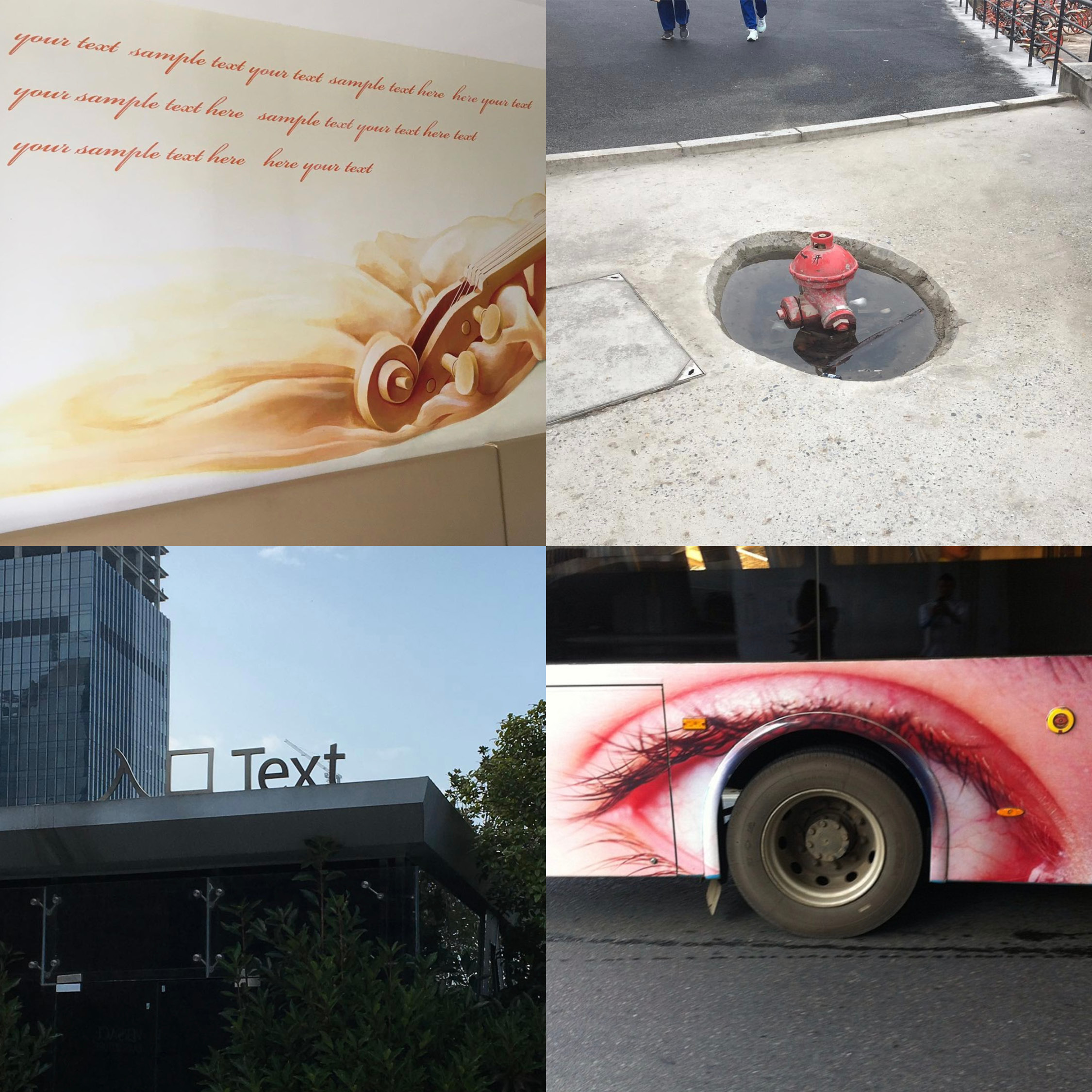
pic. 9
This set of photographs was taken in Changsha and showed unusual moments of “visual communication”. Two of them show placebo texts. You know, those you would find in designers mockups. However, here they are shown in their final and conclusive stages, post-production. One of them, set in a script font, repeats the word “your sample text here”. This was actually taken in Vienna Hotel (a chain) while being quarantined. There, the roman script form is accepted as a standard element of exotic decoration. It is on the same level as tattooing onto oneself Chinese characters that you cannot pronounce. For most, it is acceptable. But we wonder who gets away with this? This is also part of the cultural imagination of design here. Obviously, we haven’t conducted a thorough research or contacted the minds behind these works. We aren’t interested in doing that. But we see them as moments, flashes, things that are made in a flash and that aren’t considered – especially when they involve dual languages, with English always asserting China’s position as an international economic force. That is where this exoticism stems from. But only the look suffices whereas “most cannot read it”. Flaunting the look’n’feel of a much fantasized West, may it be Disney’s West or Daniel Libeskind’s West, is absolutely sufficient. Grotesque and unconcerned, they bring us much joy and offer quite a pied de nez to every identity guidelines ever written. Your text here.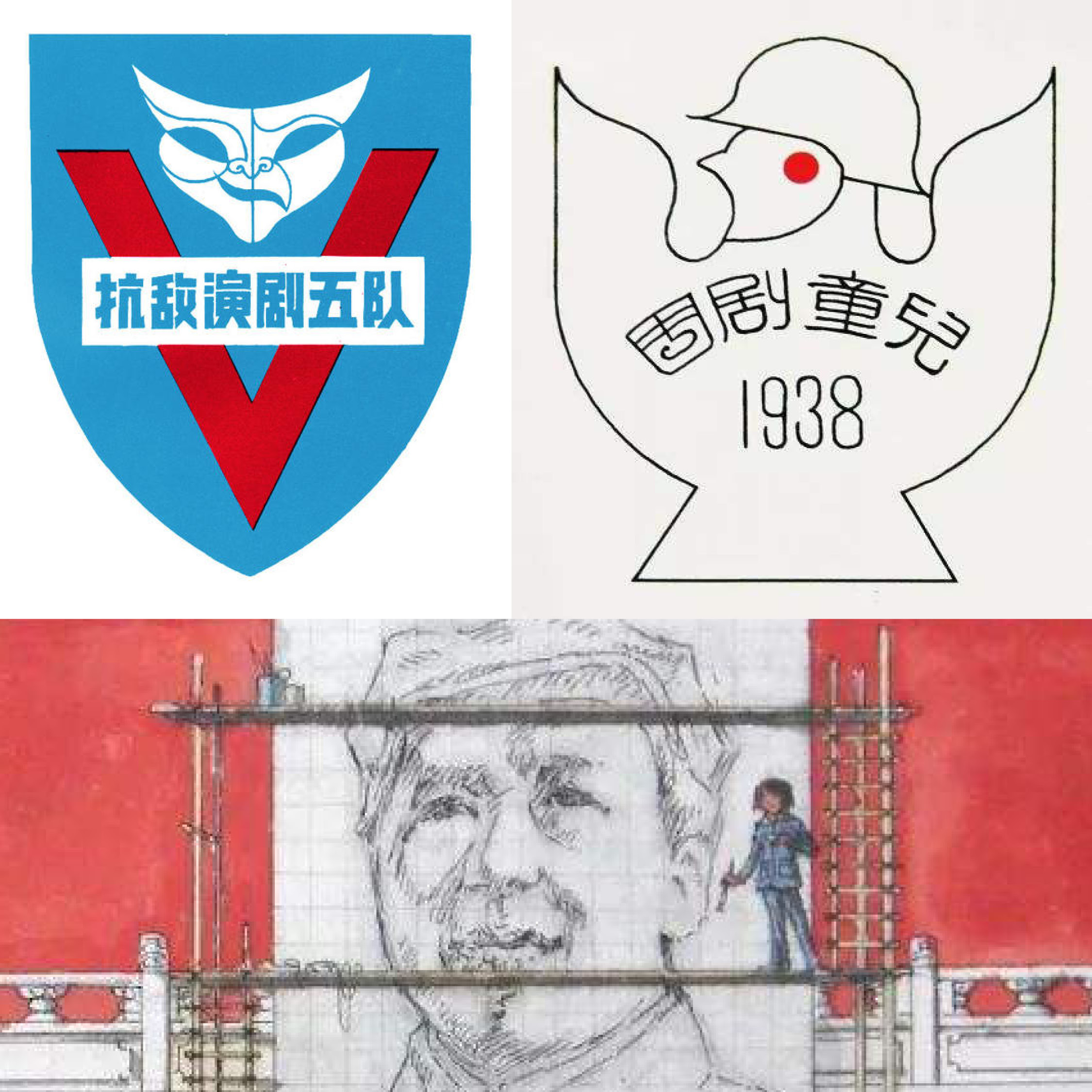
pic. 10
This set of images were shown at the Hunan Provincial Art Museum in Changsha this January. The exhibition is a retrospective of 101 years old Chinese graphic designer and artist Zhou Lingzhao who is also from Hunan Province. He was first a painter and painted everything, but as he explains “painters also encountered many social needs in society back then. To meet the needs of society I became a designer”. The people say he is the designer of the Party’s national image. For us, he is the designer whose work has been best implemented all around and in the whole known universe.
The exhibition features some of his figurative paintings, portraits, landscapes, and designs. Most of the design works were made for or were related to the Communist Party. For example, he participated in the design of the national emblem, he painted one of Mao’s portraits in Tiananmen, etc. Amongst the various and very “red” works he did, two caught our attention. The first is an armband designed for the performance of the 5th Resistance Drama Troupe in Burma in support of the Expeditionary Army (1942). The armband features masks and a “V”, which also stands for “victory”. The second is a logo design for the Changsha Children’s Theatre Company made in 1938, which shows a white dove stretching its wings, signifying that even the symbol of peace has the duty to fight back.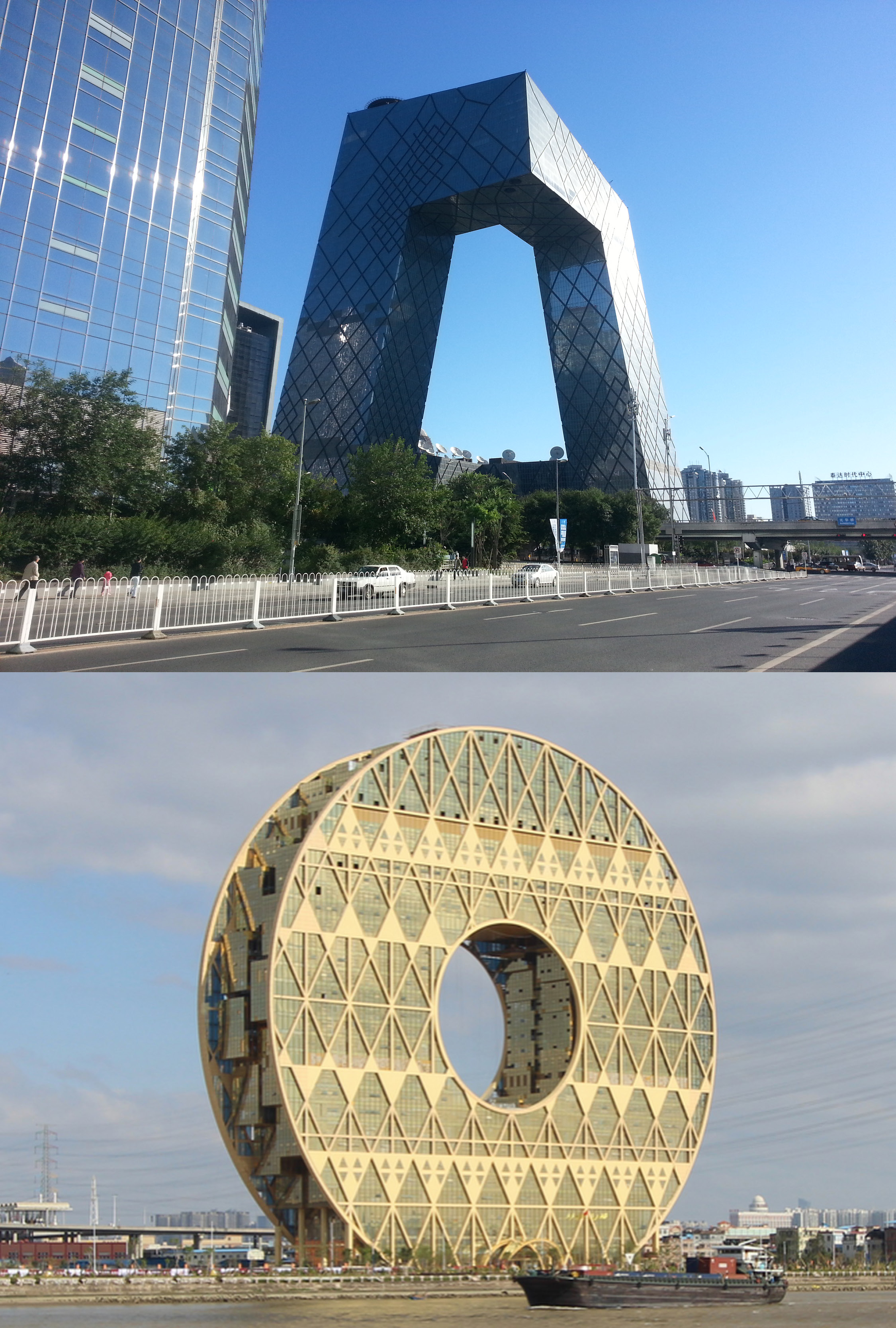
pic. 11, pic. 12
Lastly, two photographs of “weird” buildings in China. This includes the Beijing CCTV building designed by OMA in 2012, a building also affectionately known by its nickname “Big Pants”. The other image depicts a building with a shape of a big golden coin, the Guangzhouyuan Mansion, designed by Italian architect Joseph di Pasquale in 2013. President Xi at a conference on culture in 2014 said “No more weird buildings”, he then expanded on how harmonious architecture should be. But what kind of architecture is weird? In Chinese cities, you can often see lots of “strange buildings”, which some say are the result of corruption. For the sake of merit and face, some officials tend to imagine buildings that are formal exaggerations. Hiring a foreign construction firms also seems to be in vogue.
PH — I recall my time as an undergrad: “the design history we studied was all coming from the West”. China’s long history does not lack in knowledge of aesthetics. However, while modern design thinking is inherently not prevalent in China, the education of design history in Chinese universities can be very confusing to college students who have never seen the house that Le Corbusier built or do not understand why the Bauhaus is important.
MH — With a few years of teaching experience in China, I have noticed that anthropomorphism is a way many designers use to conceptualize objects and make them more relatable. By giving things the form of an animal or a thing, you give it symbolism and a narrative. In the end, there is a fine line between a neutral symbol and one that triggers the deeper sentiment of belonging to one unique greater entity. I think it is unnecessary that every designed object does the latter. This is where we disconnect from this method of design-making. This design approach is quite different from the West, where abstraction has been largely accepted.
10.03.2563, ไทรม้า, นนทบุรี
วิน — คุณสังเกตเห็นความแตกต่างเวลาต้องพูดคุย ทำงาน ใช้เวลา ออกแบบ หรือสอนการออกแบบกราฟิกระหว่างให้กับคนที่นิวยอร์กกับคนที่ฉางชามั้ย? ภาษามีบทบาทยังไง เป็นข้อจำกัดหรือช่วยเปิดพื้นที่ให้รูปแบบของปฏิสัมพันธ์ทั้งออนไลน์และออฟไลน์?
27.03.2563, ฉางชา, หูหนาน
แมกซ์ — แน่นอนว่ามีข้อแตกต่างมากมายระหว่างการทำงานที่ฉางชากับที่นิวยอร์ก และเราคิดว่าช่วงเวลาที่นิวยอร์กเป็นเหมือนกับแค่คนที่บังเอิญผ่านมา ขอเทียบให้ดูอีกที เมืองทั้งสองเมืองมีประชาชนราว 8 ล้านคนเหมือนกัน แต่คุณจะแปลกใจในความแตกต่างเชิงวัฒนธรรมระหว่างเมืองทั้งสองเมือง เราไม่อยากคุยเรื่องนิวยอร์กเท่าไหร่ การตัดสินใจใช้ชีวิตในฉางชาและทำในสิ่งที่เราทำเป็นการทดลองอย่างแน่นอน หลายครั้งที่การออกแบบถูกเชื่อมโยงกับเมืองใหญ่ เหมือนว่าคนต้องอยู่ในเมืองอย่างปักกิ่ง อัมสเตอร์ดัม หรือเบอร์ลินเท่านั้น ถึงจะ “ประสบความสำเร็จ” ได้ เพราะเมืองเหล่านั้นมีวัฒนธรรม (และสนับสนุนวัฒนธรรม) ในแง่นั้น เมืองที่เราอยู่ไม่เท่เลย หลายครั้งที่งานที่เราได้ทำมาจากเมืองอื่น และเราต้องเดินทางเยอะมากหรือไม่ก็ต้องเน็ตเวิร์กกิ้งเยอะมาก การใช้ชีวิตในฉางชา ชีวิตเชิงวัฒนธรรมจะวนอยู่แค่เรื่องของประเพณีและอัตลักษณ์ความเป็นหูหนาน และอาจจะวนไปวนมาได้อยู่แค่นี้
แต่การขาดหายไปของวัฒนธรรมนี้ กลับให้เวลาเรามองลึกลงในวิสัยทัศน์ “สมัยใหม่” ของจีน โดยเฉพาะอย่างยิ่งในกรณีของฉางชา (เมืองหลวงของมณฑลหูหนาน) ซึ่งจัดเป็นเมืองรองอันดับสอง มีเมืองแบบนี้อีกหลายเมืองในจีน และเราคิดว่า ในบางแง่มุม เมืองต่างๆ เหล่านี้กำลังเป็นตัวแทนแสดงวิสัยทัศน์ของประเทศได้ดีกว่าปักกิ่งหรือเซี่ยงไฮ้
กลับมาที่การเปรียบเทียบ เราพบว่าลูกค้าชาวจีนค่อนข้างเปิดกว้างกับความเป็นไปได้ของฟอร์มในงานออกแบบ ในหลายๆ กรณี พอมาเทียบกันแล้ว ในอเมริกามีความคาดหวังของภาพที่คาดว่าจะได้เห็น “ซ่อนอยู่เบื้องหลัง” หรือถ้าเทียบกันคือ ความคาดหวังจากตลาดว่างานออกแบบควรจะออกมหน้าตาแบบไหนมากกว่ามาก โดยเฉพาะอย่างยิ่งในตลาดกระแสหลัก แต่ยิ่งหนักในตลาดเฉพาะกลุ่ม จนถึงตอนนี้ เรายังฟันธงไม่ได้ว่าความเปิดกว้างของลูกค้าในจีนนี้มาจากไหน
รูป 9
ภาพชุดนี้ถ่ายที่ฉางชา แสดงการ “สื่อสารด้วยภาพ” ที่ดูประหลาด ภาพสองภาพในชุดนี้เป็นภาพถ่ายเนื้อหาปลอม (placebo texts) แบบที่เห็นกันในม็อคอัพงานออกแบบ นึกออกมั้ย แต่ในภาพสองภาพนี้ เนื้อหาปลอมถูกใช้ในงานที่ผลิตเสร็จเรียบร้อยแล้ว ภาพหนึ่งในสองภาพเป็นภาพประโยคแบบลายมือเขียนซ้ำไปซ้ำมาว่า “เขียนตัวอย่างเนื้อหาของคุณที่นี่” ถ่ายที่โรงแรมเวียนนา (เป็นเครือโรงแรม) ช่วงที่เรากักตัวเองที่จีน ตัวเขียนแบบอักษรโรมันเป็นที่ยอมรับแพร่หลายในฐานะองค์ประกอบมาตรฐานในการตกแต่งให้ดูเป็นต่างประเทศ เหมือนเวลาคุณเห็นคนสักตัวหนังสือภาษาจีนที่คุณอ่านไม่ออก สำหรับคนส่วนมาก นี่อาจยังพอรับได้ แต่เราสงสัยว่ารอดมาได้ยังไง นี่ยังเป็นส่วนหนึ่งของจินตนาการทางวัฒนธรรมของงานออกแบบในจีน แน่นอนว่าเรายังไม่ได้สำรวจอย่างละเอียดหรือติดต่อผู้อยู่เบื้องหลังงานเหล่านี้ เราไม่ได้สนใจเรื่องใครทำ แต่เรามองเป็นช่วงเวลา เป็นชั่วแวบนึงที่ของถูกสร้างภายในพริบตาแบบไม่คิด โดยเฉพาะอย่างยิ่งเวลาออกแบบงานสองภาษา ภาษาอังกฤษจะเข้ามาแทนที่ภาษาจีนในการสื่อถึงพลังทางเศรษฐกิจระดับนานาชาติ และนี่คือที่มาของการออกแบบให้ดูเป็นต่างประเทศ ที่แค่มองเห็นก็พอแล้ว ในเมื่อ “ยังไงคนส่วนใหญ่ก็อ่านไม่ออกอยู่ดี” เป็นการโอ้อวดทั้งเชิงภาพและความรู้สึกของความเป็นตะวันตกแบบคิดจินตนาการเอาเอง จะเป็นตะวันตกแบบดิสนีย์หรือจะแบบแดเนียล ลิเบสไคน์ ก็ได้ทั้งนั้น ทั้งพิลึกพิลั่นพอๆ กับไม่ใส่ใจ นี่เป็นความบันเทิงสำหรับเรา เหมือนเป็นการดูถูกเอกสารไกด์ไลน์อัตลักษณ์ทุกชิ้นที่มีการทำขึ้นมา เขียนความเห็นของคุณต่อได้เลย
รูป 10
ภาพชุดนี้จัดแสดงที่พิพิธภัณฑ์ศิลปะมณฑลหูหนานในฉางชาเมื่อเดือนมกราคมที่ผ่านมา ในนิทรรศการ 101 ปี แห่งชาตกาลของโจวหลิงเจา นักออกแบบกราฟิกและศิลปินจีนซึ่งเป็นคนหูหนาน เขายังเป็นจิตกรคนแรกที่วาดภาพทุกอย่าง เขาอธิบายว่า “จิตรกรก็ต้องเผชิญกับความต้องการทางสังคมในสังคมสมัยก่อนเช่นกัน เพื่อตอบสนองข้อเรียกร้องของสังคม ผมจึงผันตัวไปเป็นนักออกแบบ” คนบอกว่าเขาเป็นคนออกแบบภาพความเป็นชาติให้กับพรรคคอมมิวนิสต์จีน สำหรับเรา เขาคือนักออกแบบที่งานพบเห็นได้ทั่วไปแพร่หลายที่สุดในจักรวาลที่เรารู้จัก นิทรรศการนี้นำเสนอผลงานบางส่วนของเขา ทั้งภาพจิตรกรรมเชิงอุปมาอุปมัย ภาพเหมือนบุคคล ภาพภูมิทัศน์ และงานออกแบบที่เขาทำให้กับพรรคคอมมิวนิสต์ หรือไม่ก็เกี่ยวข้องกับพรรคฯ ทางใดทางหนึ่ง ตัวอย่างเช่น เขาเข้าร่วมการออกแบบตราสัญลักษณ์ประจำชาติ เขาวาดภาพเหมือนท่านประธานเหมาภาพหนึ่งที่จตุรัสเทียนอันเหมิน ฯลฯ ท่ามกลางงานมากมายและ “เป็นคอมมิวนิสต์” มากของเขา มีงานสองชิ้นที่เตะตาเราเป็นพิเศษ ชิ้นแรกเป็นปลอกแขนออกแบบให้กับการแสดงของคณะละครฝ่ายต่อต้านที่ 5 ที่สนับสนุนกองกำลังการรบนอกประเทศในพม่า (2485) มีตัวอักษร “วี” (V) ซึ่งย่อจากคำว่า “ชัยชนะ” (Victory) ชิ้นที่สองเป็นโลโก้ออกแบบในปี 2481 ให้กับคณะละครเด็กฉางชา เป็นรูปนกพิราบขาวสยายปีก เป็นสัญลักษณ์แสดงให้เห็นว่า กระทั่งสัญลักษณ์แห่งสันติภาพก็มีหน้าที่ต้องสู้กลับด้วยเช่นกัน
รูป 11, รูป 12
สุดท้ายภาพอาคารรูปทรง “ประหลาด” ในเมืองจีนสองภาพ เป็นภาพอาคารสถานีโทรทัศน์ CCTV ปักกิ่ง ออกแบบโดย OMA ในปี 2555 มีชื่อเล่นน่าเอ็นดูว่า “กางเกงยักษ์” ภาพอีกภาพหนึ่งเป็นอาคารทรงเหรียญอีแปะทอง หรืออาคารกวางโจวหยวนแมนชั่น ออกแบบโดยสถาปนิกชาวอิตาลี โจเซป ดิ ปาสกวาล ในปี 2556 ประธานาธิบดีสีเคยกล่าวไว้ในการประชุมทางวัฒนธรรมครั้งหนึ่งในปี 2557 ว่า “ไม่เอาตึกประหลาดแล้ว” และได้ขยายความต่อว่าสถาปัตยกรรมควรมีความกลมกลืนกันยังไง แต่สถาปัตยกรรมแบบไหนถึงเรียกว่าแปลกประหลาด? ในเมืองต่างๆ ในจีน คุณก็เห็นตึก “หน้าตาแปลกๆ ” อยู่ไม่น้อย ซึ่งบางคนบอกว่าเป็นผลของการคอรัปชั่น เพื่อเอาดีและเอาหน้า ข้าราชการบางคนมีแนวโน้มจะคิดถึงตึกหน้าตาสุดโต่ง การว่าจ้างบริษัทออกแบบรับเหมาก่อสร่างต่างชาติก็เป็นที่นิยมมาก
เพียนเพียน — จำได้ว่าสมัยเรียนปริญญาตรี “ประวัติศาสตร์การออกแบบที่เราเรียนเป็นเรื่องทางตะวันตกหมด” ทั้งๆ ที่ประวัติศาสตร์จีนอันยาวนานไม่ได้ขาดองค์ความรู้ด้านสุนทรียศาสตร์เลย แต่ขณะที่แก่นของการคิดเชิงออกแบบแบบสมัยใหม่ในจีนไม่ได้แพร่หลาย การศึกษาประวัติศาสตร์การออกแบบตามอย่างตะวันตกในมหาวิทยาลัยจีน จึงอาจสร้างความสับสนงงงวยอย่างมากให้แก่นักศึกษาที่ไม่เคยเห็นบ้านที่เลอ คอร์บูซิเย่ออกแบบ หรือทำให้พวกเขาไม่เข้าใจว่าทำไมเบาเฮาส์ถึงสำคัญ
แมกซ์ — จากประสบการณ์สองสามปีที่ได้สอนในจีน ผมสังเกตเห็นว่ามานุษยรูปนิยม (anthropomorphism) เป็นวิธีที่นักออกแบบหลายคนใช้สร้างแนวคิดให้กับวัตถุ และทำให้เข้าถึงได้มากขึ้น ออกแบบให้สิ่งของมีรูปทรงเหมือนสัตว์หรือเหมือนสิ่งต่างๆ คุณให้สัญญะและเรื่องเล่าแก่วัตถุ ท้ายที่สุด มีเส้นบางๆ ระหว่างสัญลักษณ์ที่เป็นกลางและสัญลักษณ์ที่กระตุ้นความรู้สึกลึกๆ ของการได้เป็นส่วนหนึ่งของความเป็นหนึ่งอันหนึ่งอันเดียวที่ยิ่งใหญ่กว่า ผมคิดว่าไม่จำเป็นที่จะออกแบบวัตถุทั้งหมดในแบบหลัง ตรงนี้คือจุดที่เราตัดขาดจากกลวิธีของการออกแบบ การเข้าหาการออกแบบในวิธีนี้ต่างจากทางตะวันตกมาก ที่ยอมรับความเป็นนามธรรมได้แพร่หลายกว่า
10.03.2020, Sai Ma, Nonthaburi
WS — You’ve been in Bangkok for a couple of weeks now. Any thoughts on how graphic design (images, texts, videos, visual artifacts) inhabits and propagates throughout this city?
16.03.2020, On Nut BTS, Bangkok
PH & MH — We stayed in Bangkok for about two months and we were absolutely charmed by the city, it is certainly a place like no other. We loved to interact with literally everyone. It is difficult to describe it in words, perhaps the word “affectionate” is properly suited. We are struggling to describe how we felt from seeing the graphic design throughout the city, and not knowing the language doesn’t help either. But there is one thing: we were definitely shocked by how important physical appearances seemed to be to function well in this society. This was a little disorienting during the first few weeks. Literally anything advertising is promoted by sexy models, of both sexes. And they are everywhere, promoting everything. And cosmetics! No one has ever enough cosmetics! No other cities we have previously visited can equate this. The flip side of this is: beauty, which cannot be a fault in itself.
10.03.2563, ไทรม้า, นนทบุรี
วิน — ตอนนี้คุณอยู่กรุงเทพฯ มาได้สองสามอาทิตย์แล้ว คิดยังไงงานออกแบบกราฟิก (ภาพ เนื้อหา วิดีโอ ข้าวของต่างๆ) ในเมืองนี้บ้าง
16.03.2563, บีทีเอสอ่อนนุช, กรุงเทพฯ
เพียนเพียน และ แมกซ์ — เราอยู่กรุงเทพฯ มาได้สองเดือนแล้ว และเหมือนต้องมนต์เมืองนี้ กรุงเทพฯ ไม่เหมือนเมืองอื่นๆ เลย เรารักการได้ปฏิสัมพันธ์กับทุกคนที่นี่จริงๆ อธิบายออกมาเป็นคำพูดยาก บางทีคำว่า “เป็นที่รัก” อาจจะเหมาะสมที่สุด ลำบากมากทุกครั้งเวลาต้องอธิบายความรู้สึกออกมาเป็นคำพูดเวลาเห็นงานกราฟิกในกรุงเทพฯ และการที่เราอ่านภาษาไทยไม่ออกยิ่งไม่ได้ช่วยเข้าไปใหญ่ แต่อย่างหนึ่งแน่ๆ ก็คือ เราช็อคมากตอนเห็นว่ารูปลักษณ์ดูเหมือนจะมีความสำคัญมากๆ ในสังคมไทย ช่วงสองสามอาทิตย์แรกยังมองไม่ออก แต่ทุกอย่าง และเราหมายถึงทุกอย่างจริงๆ ที่เป็นโฆษณาจะถูกโปรโมทผ่านนางแบบนายแบบที่ดูเซ็กซี่ พวกเขาอยู่ทุกหนทุกแห่ง และขายได้ทุกอย่าง ไหนจะเรื่องเครื่องสำอางอีก ไม่มีเมืองไหนที่เราเคยไปสู้กรุงเทพฯ ได้เลย ด้านกลับกันของเรื่องนี้คือ คงามงามในตัวของมันเองไม่เคยเป็นเรื่องผิดเลย
Image credits
pic. 1 — Image courtesy of the designer, Pianpian He and Max Harvey.
pic. 2 — Image courtesy of the designer, Pianpian He and Max Harvey.
pic. 3 — Creative Commons Cold Sweet Paan by Biswarup Ganguly is licensed under CC by 3.0
pic. 4 — Marker, Chris, C 2018, Chris Marker, La Cinémathéque française. (Scanned by Pianpian He).
pic. 5 — Creative Commons Shenzhen May-2017 by Mitch Altman is licensed under CC by SA 2.0
pic. 6 — Image courtesy of the designer, Pianpian He and Max Harvey.
pic. 7 — Image courtesy of the designer, Pianpian He and Max Harvey.
pic. 8 — Screenshotted by Pianpian He.
pic. 9 — Image courtesy of Max Harvey.
pic. 10 — Zhou Lingzhao’s graphic works, http://www.hunantoday.cn/article/201912/201912241731331368.html
pic. 11 — Creative Commons CCTV building in Beijing is licensed under CC by SA 3.0
pic. 12 — Guangzhou Circle is licensed under CC by SA 3.0
เครดิตภาพ
รูป 1 — ภาพโดยความอนุเคราะห์จากนักออกแบบ เพียนเพียน เหอ และแมกซ์ ฮาร์วีย์
รูป 2 — ภาพโดยความอนุเคราะห์จากจากนักออกแบบ เพียนเพียน เหอ และแมกซ์ ฮาร์วีย์
รูป 3 — Creative Commons Cold Sweet Paan โดย บิสวรุป กางกูลี ได้รับอนุญาตภายใต้ CC by 3.0
รูป 4 — มาร์กเกอร์, คริส, C 2018, Chris Marker, ลา ซิเนมาทีค ฟรองแซส (ภาพสแกนจากหนังสือ โดย เพียนเพียน เหอ)
รูป 5 — Creative Commons Shenzhen May-2017 โดย มิชท์ อัลท์แมน ได้รับอนุญาตภายใต้ CC by SA 2.0
รูป 6 — ภาพโดยความอนุเคราะห์จากนักออกแบบ เพียนเพียน เหอ และแมกซ์ ฮาร์วีย์
รูป 7 — ภาพโดยความอนุเคราะห์จากนักออกแบบ เพียนเพียน เหอ และแมกซ์ ฮาร์วีย์
รูป 8 — สกรีนชอตโดย เพียนเพียน เหอ
รูป 9 — ภาพโดยความอนุเคราะห์จาก แมกซ์ ฮาร์วีย์
รูป 10 — งานออกแบบกราฟิกของโจวหลิงเจา http://www.hunantoday.cn/article/201912/201912241731331368.html
รูป 11 — CCTV building in Beijingได้รับอนุญาตภายใต้ CC by SA 3.0
รูป 12 — Guangzhou Circleได้รับอนุญาตภายใต้ CC by SA 3.0